Showing posts with label statistical sins. Show all posts

Wednesday, May 2, 2018

Statistical Sins: Is Your Classification Model Any Good?

Prediction with Binomial Regression April A to Z is complete! We now return to your regularly scheduled statistics blog posts! Today, I want to talk about an issue I touched on during A to Z: using regression to predict values and see how well your model is doing.

Specifically, I talked a couple of times about binomial regression (here and here), which is used to predict (read: recreate with a set of variables significantly related to) a binary outcome. The data example I used involved my dissertation data and the binary outcome was verdict: guilty or not guilty. A regression model returns the linear correction applied to the predictor variables to reproduce the outcome, and will highlight whether a predictor was significantly related to the outcome or not. But a big question you may be asking of your binomial model is: how well does it predict the outcome? Specifically, how can you examine whether your regression model is correctly classifying cases?

We'll start by loading/setting up the data and rerunning the binomial regression with interactions.
dissertation<-read.delim("dissertation_data.txt",header=TRUE)
dissertation<-dissertation[,1:44]
predictors<-c("obguilt","reasdoubt","bettertolet","libertyvorder",
              "jurevidence","guilt")
dissertation<-subset(dissertation, !is.na(libertyvorder))

dissertation[45:50]<-lapply(dissertation[predictors], function(x) {
  y<-scale(x, center=TRUE, scale=TRUE)
  }
)

pred_int<-'verdict ~ obguilt.1 + reasdoubt.1 + bettertolet.1 + libertyvorder.1 + 
                  jurevidence.1 + guilt.1 + obguilt.1*guilt.1 + reasdoubt.1*guilt.1 +
                  bettertolet.1*guilt.1 + libertyvorder.1*guilt.1 + jurevidence.1*guilt.1'
model<-glm(pred_int, family="binomial", data=dissertation)
summary(model)
## 
## Call:
## glm(formula = pred_int, family = "binomial", data = dissertation)
## 
## Deviance Residuals: 
##     Min       1Q   Median       3Q      Max  
## -2.6101  -0.5432  -0.1289   0.6422   2.2805  
## 
## Coefficients:
##                         Estimate Std. Error z value Pr(>|z|)    
## (Intercept)             -0.47994    0.16264  -2.951  0.00317 ** 
## obguilt.1                0.25161    0.16158   1.557  0.11942    
## reasdoubt.1             -0.09230    0.20037  -0.461  0.64507    
## bettertolet.1           -0.22484    0.20340  -1.105  0.26899    
## libertyvorder.1          0.05825    0.21517   0.271  0.78660    
## jurevidence.1            0.07252    0.19376   0.374  0.70819    
## guilt.1                  2.31003    0.26867   8.598  < 2e-16 ***
## obguilt.1:guilt.1        0.14058    0.23411   0.600  0.54818    
## reasdoubt.1:guilt.1     -0.61724    0.29693  -2.079  0.03764 *  
## bettertolet.1:guilt.1    0.02579    0.30123   0.086  0.93178    
## libertyvorder.1:guilt.1 -0.27492    0.29355  -0.937  0.34899    
## jurevidence.1:guilt.1    0.27601    0.36181   0.763  0.44555    
## ---
## Signif. codes:  0 '***' 0.001 '**' 0.01 '*' 0.05 '.' 0.1 ' ' 1
## 
## (Dispersion parameter for binomial family taken to be 1)
## 
##     Null deviance: 490.08  on 354  degrees of freedom
## Residual deviance: 300.66  on 343  degrees of freedom
## AIC: 324.66
## 
## Number of Fisher Scoring iterations: 6

The predict function, which I introduced here, can also be used for the binomial model. Let's have R generate predicted scores for everyone in the dissertation sample:

dissertation$predver<-predict(model)
dissertation$predver
##   [1]  0.3907097456 -4.1351129605  2.1820478279 -2.8768390246  2.5804618523
##   [6]  0.4244692909  2.3065468369 -2.7853434926  0.3504760502 -0.2747339639
##  [11] -1.8506160725 -0.6956240161 -4.7860574839 -0.3875950731 -2.4955679446
##  [16] -0.3941516951 -4.5831011509  1.6185480937  0.4971923298  4.1581842900
##  [21] -0.6320531052 -4.8447046319 -2.3974890696  1.8566258698  0.0360685822
##  [26]  2.2151040131  2.3477149003 -2.4493726369 -0.2253481404 -4.8899805287
##  [31]  1.7789459288 -0.0978703861 -3.5541042186 -3.6009218603  0.1568318789
##  [36]  3.7866003489 -0.6371816898 -0.7047761441 -0.7529742376 -0.0302759317
##  [41] -0.1108055330  1.9751810033  0.2373614802  0.0424471071 -0.4018757856
##  [46]  0.0530272726 -1.0763759980  0.0099577637  0.3128581222  1.4806679691
##  [51] -1.7468626219  0.2998282372 -3.6359162016 -2.2200774510  0.3192366472
##  [56]  3.0103216033 -2.0625775984 -6.0179845235  2.0300503627  2.3676828409
##  [61] -2.8971753746 -3.2131490026  2.1349358889  3.0215336139  1.2436192890
##  [66]  0.2885535375  0.2141821004  1.9480686936  0.0438751446 -1.9368013875
##  [71]  0.2931258287  0.5319938265  0.0177643261  3.3724920900  0.0332949791
##  [76]  2.5935500970  0.7571810150  0.7131757400  2.5411073339  2.8499853550
##  [81]  2.8063291084 -0.4500738791  1.4700679077 -0.8659309719  0.0870492258
##  [86]  0.5728074322  0.1476797509  2.4697257261  2.5935500970 -2.2200774510
##  [91] -0.0941827753  1.3708676633  1.4345235392 -0.2407209578  2.4662700339
##  [96] -1.9687731888 -6.7412580522 -0.0006224018 -4.4132951092 -2.8543032695
## [101]  1.2295635352  2.8194173530  0.1215689324 -3.8258079371  1.8959803882
## [106] -4.5578801595  2.3754402614  0.0826808026  1.5112359711 -3.5402060466
## [111]  0.2556657363  0.7054183194  1.4675797244 -2.3974890696  2.6955929822
## [116] -0.3123518919 -4.8431862346 -2.0132721372  0.4673405434 -2.3053405270
## [121]  1.9498822386 -0.5164183930 -1.8277820872 -0.0134750769 -2.3013547136
## [126] -0.2498730859 -4.4281010683 -0.0134750769 -0.2604532514  0.1476797509
## [131] -2.3392939519 -2.0625775984 -3.5541042186  1.5087477879 -4.6453051124
## [136]  2.0616474606 -3.2691362859 -7.3752231145 -1.6666447439  1.0532964013
## [141] -2.0625775984 -0.3355312717  2.2481601983 -2.2200774510 -4.3276959075
## [146]  0.8685972087 -0.7727065311  1.7511589809 -0.4774548995  0.0008056357
## [151]  1.7022334970 -0.4202625135 -0.2902646169  2.4409712692  0.0008056357
## [156]  0.0008056357 -3.6009218603 -0.8567788439 -0.4528474822  0.3517462520
## [161]  0.1307210605 -3.7843118182 -2.8419024763 -3.5191098774 -0.1460684795
## [166]  1.8809888141  2.8194173530 -2.4656469123  1.0589888029  0.1659840070
## [171]  1.4345235392  2.3676828409  1.5749534339 -0.1681557545  2.6406620359
## [176]  0.1476797509 -2.2135177411  1.9168260534 -3.4993205379  0.4557086940
## [181] -3.8136089417 -0.1121510987 -3.9772095600  1.3849234171  0.3504760502
## [186]  2.3807710856 -3.0667307601  2.3040586537  1.7599138086 -0.2083894500
## [191]  0.6844579761 -0.3552635652 -1.9459392035 -0.6075281598 -2.1663310490
## [196]  2.3676828409 -1.9205271122 -2.2334295071 -4.4265826710 -1.0117771483
## [201] -0.0161530548 -0.3072233074 -0.0161530548 -0.7451676752 -7.0351269313
## [206]  2.6406620359 -3.7523234832 -0.2498730859  2.0222929422  3.2886316225
## [211] -1.6221457956  2.4749949634  1.7570711677  0.0904873650 -4.7332807307
## [216]  0.1568318789 -0.0302759317  0.5127229828  1.3097316594 -6.9309218514
## [221]  0.0515992352 -0.4514194447 -0.2253481404 -4.7652690656 -0.4279866041
## [226] -4.4136563866 -3.7618312672  0.0156676181 -0.2590252139  2.6076058507
## [231]  1.6420333133 -3.9985172969 -6.2076483227  0.1632104039  0.1829426974
## [236] -4.7652690656 -4.4212844958  1.6001906117  0.8579971472 -3.8699110198
## [241]  0.3022779567 -0.1679979189  1.9421248181  0.6592738895  1.6132788564
## [246] -0.0366544567 -3.4818233673 -3.9422152187 -0.3473613776  0.4321933815
## [251]  0.7480288869 -0.2498730859 -1.9861068488 -2.2297920164 -0.7621263656
## [256]  1.2966434147  0.1632104039  0.2048721368  1.7789459288  0.4926393080
## [261]  0.4096285430 -1.7794744955 -2.5822853071  2.0413250624 -6.6574350219
## [266] -0.1277642235 -2.1972434657 -2.5075677545 -0.4482774141 -0.6943740757
## [271] -0.7821891015  6.3289445390  0.1568318789  0.1165981835  1.4781797859
## [276] -4.2287015488 -3.6157278195 -0.1511970641 -0.7047761441  2.0935344484
## [281] -3.8258079371 -4.4231102471  1.3097316594  3.4081542651 -0.4996175382
## [286] -2.0534397824  0.9783975145 -2.2562634924  3.7196170683  1.1110084017
## [291]  2.1661785291 -4.2138955896  1.9421248181  2.3065468369 -0.7139282722
## [296] -4.1431023472 -2.0854115837  2.9389399956  1.7711269214 -0.0302759317
## [301] -2.6458711124  0.5856241187 -0.1199576611  1.8566258698 -2.2383553905
## [306]  2.3807710856 -0.2838860920  3.1176953128  2.8499853550  2.8063291084
## [311]  0.0034011417 -0.4683781352 -3.0377484314 -1.3833686805  1.7764577456
## [316]  1.7842151661  3.4081542651  0.1165981835 -4.6988069009 -2.6013721641
## [321]  2.0616474606 -0.2498730859 -4.2207121622  4.1705330009  5.2103776377
## [326] -4.5406977837 -1.5080855068 -2.5232652805 -5.7259789038  2.5211393933
## [331] -0.3487069432 -2.5035573312 -2.2764097339 -5.8364854607 -1.8694684539
## [336]  1.3402996614  0.5728074322  0.3663267540 -0.1603491921 -2.1690805453
## [341] -1.4105339689  3.0768201201 -5.1065624241 -4.5966850670 -4.5498907729
## [346] -1.3078399029 -1.0882592824  0.3128581222 -0.3644156933  0.3100845191
## [351]  2.4774831467 -1.0763759980  2.2151040131 -0.0952748801 -4.6864864366

Now, remember that the outcome variable is not guilty (0) and guilty (1), so you might be wondering - what's with these predicted values? Why aren't they 0 or 1?

Binomial regression is used for nonlinear outcomes. Since the outcome is 0/1, it's nonlinear. But binomial regression is based on the general linear model. So how can we apply the general linear model to a nonlinear outcome? Answer: by transforming scores. Specifically, it transforms the outcome into a log odds ratio; the log transform makes the outcome variable behave somewhat linearly and symmetrically. The predicted outcome, then, is also a log odds ratio.

ordvalues<-dissertation[order(dissertation$predver),]
ordvalues<-ordvalues[,51]
ordvalues<-data.frame(1:355,ordvalues)
colnames(ordvalues)<-c("number","predver")
library(ggplot2)
ggplot(data=ordvalues, aes(number,predver))+geom_smooth()
## `geom_smooth()` using method = 'loess'

Log odds ratios are great for analysis, but when trying to understand how well your model is predicting values, we want to convert them into a metric that's easier to understand in isolation and when compared to the observed values. We can convert them into probabilities with the following equation:

dissertation$verdict_predicted<-exp(predict(model))/(1+exp(predict(model)))

This gives us a value ranging from 0 to 1, which is the probability that a particular person will select guilty. We can use this value in different ways to see how well our model is doing. Typically, we'll divide at the 50% mark, so anyone with a probability of 0.5 or greater is predicted to select guilty, and anyone with a probability less than 0.5 would be predicted to select not guilty. We then compare this new variable with the observed results to see how well the model did.

dissertation$vpred_rounded<-round(dissertation$verdict_predicted,digits=0)
library(expss)
## Warning: package 'expss' was built under R version 3.4.4
dissertation<- apply_labels(dissertation,
                      verdict = "Actual Verdict",
                      verdict = c("Not Guilty" = 0,
                                        "Guilty" = 1),
                      vpred_rounded = "Predicted Verdict",
                      vpred_rounded = c("Not Guilty" = 0,
                                        "Guilty" = 1)
)
cro(dissertation$verdict,list(dissertation$vpred_rounded, total()))
 Predicted Verdict    #Total 
 Not Guilty   Guilty   
 Actual Verdict 
   Not Guilty  152 39   191
   Guilty  35 129   164
   #Total cases  187 168   355
One thing we could look at regarding this table, which when dealing with actual versus predicted categories is known as a confusion matrix, is how well the model did at correctly categorizing cases - which we get by adding together the number of people with both observed and predicted not guilty, and people with observed and predicted guilty, then dividing that sum by the total.

accuracy<-(152+129)/355
accuracy
## [1] 0.7915493

Our model correctly classified 79% of the cases. However, this is not the only way we can determine how well our model did. There are a variety of derivations you can make from the confusion matrix. But two you should definitely include when doing this kind of analysis are sensitivity and specificity. Sensitivity refers to the true positive rate, and specificity refers to the true negative rate.

When you're working with confusion matrices, you're often trying to diagnose or identify some condition, one that may be deemed positive or present, and the other that may be deemed negative or absent. These derivations are important because they look at how well your model identifies these different states. For instance, if most of my cases selected not guilty, I could get a high accuracy rate by simply predicting that everyone will select not guilty. But then my model lacks sensitivity - it only identifies negative cases (not guilty) and fails to identify any positive cases (guilty). If I were dealing with something even higher stakes, like whether a test result indicates the presence of a condition, I want to make certain my classification is sensitive to those positive cases. And vice versa, I could keep from missing any positive cases by just classifying everyone as positive, but then my model lacks specificity and I may subject people to treatment they don't need (and that could be harmful).

Just like accuracy, sensitivity and specificity are easy to calculate. As I said above, I'll consider not guilty to be negative and guilty to be positive. Sensitivity is simply the number of true positives (observed and predicted guilty) divided by the sum of true positives and false negatives (people who selected guilty but were classified as not guilty).

sensitivity<-129/164
sensitivity
## [1] 0.7865854

And specificity is the number of true negatives (observed and predicted not guilty) divided by the sum of true negatives and false positives (people who selected not guilty but were classified as guilty).

specificity<-152/191
specificity
## [1] 0.7958115

So the model correctly classifies 79% of the positive cases and 80% of the negative cases. The model could be improved, but it's functioning equally well across positive and negative cases, which is good.

It should be pointed out that you can select any cutpoint you want for your probability variable. That is, if I want to be very conservative in identifying positive cases, I might want there to be a higher probability that it is a positive case before I classify it as such - perhaps I want to use a cutpoint like 75%. I can easily do that.

dissertation$vpred2[dissertation$verdict_predicted < 0.75]<-0
dissertation$vpred2[dissertation$verdict_predicted >= 0.75]<-1
dissertation<- apply_labels(dissertation,
                      vpred2 = "Predicted Verdict (0.75 cut)",
                      vpred2 = c("Not Guilty" = 0,
                                        "Guilty" = 1)
)
cro(dissertation$verdict,list(dissertation$vpred2, total()))
 Predicted Verdict (0.75 cut)    #Total 
 Not Guilty   Guilty   
 Actual Verdict 
   Not Guilty  177 14   191
   Guilty  80 84   164
   #Total cases  257 98   355
accuracy2<-(177+84)/355
sensitivity2<-84/164
specificity2<-177/191
accuracy2
## [1] 0.7352113
sensitivity2
## [1] 0.5121951
specificity2
## [1] 0.9267016

Changing the cut score improves specificity but at the cost of sensitivity, which makes sense, because our model was predicting equally well (or poorly, depending on how you look at it) across positives and negatives. In this case, a different cut score won't improve our model. We would need to go back and see if there are better variables to use for prediction. And to keep us from fishing around in our data, we'd probably want to use a training and testing set for such exploratory analysis.

Wednesday, March 21, 2018

Statistical Sins: The Myth of Widespread Division

Recently, many people, including myself, have commented on how divided things have become, especially for any topic that is even tangentially political. In fact, I briefly deactivated my Facebook account, and have been spending much less time on Facebook, because of the conflicts I was witnessing among friends and acquaintances. But a recent study of community interactions on Reddit suggests that only a small number of people are responsible for conflicts and attacks:
User-defined communities are an essential component of many web platforms, where users express their ideas, opinions, and share information. However, despite their positive benefits, online communities also have the potential to be breeding grounds for conflict and anti-social behavior.

Here we used 40 months of Reddit comments and posts (from January 2014 to April 2017) to examine cases of intercommunity conflict ('wars' or 'raids'), where members of one Reddit community, called "subreddit", collectively mobilize to participate in or attack another community.

We discovered these conflict events by searching for cases where one community posted a hyperlink to another community, focusing on cases where these hyperlinks were associated with negative sentiment (e.g., "come look at all the idiots in community X") and led to increased antisocial activity in the target community. We analyzed a total of 137,113 cross-links between 36,000 communities.

A small number of communities initiate most conflicts, with 1% of communities initiating 74% of all conflicts. The image above shows a 2-dimensional map of the various Reddit communities. The red nodes/communities in this map initiate a large amount of conflict, and we can see that these conflict intiating nodes are rare and clustered together in certain social regions. These communities attack other communities that are similar in topic but different in point of view.

Conflicts are initiated by active community members but are carried out by less active users. It is usually highly active users that post hyperlinks to target communities, but it is more peripheral users who actually follow these links and particpate in conflicts.

Conflicts are marked by the formation of "echo-chambers", where users in the discussion thread primarily interact with other members of their own community (i.e., "attackers" interact with "attackers" and "defenders" with "defenders").
So even though the conflict may appear to be a widespread problem, it really isn't, at least not on Reddit. Instead, it's only a handful of users (trolls) and communities. Here's the map they reference in their summary:


The researchers will be presenting their results at a conference next month. And they also make all of their code and data available.

Wednesday, March 14, 2018

Statistical Sins: Not Creating a Codebook

I'm currently preparing for Blogging A-to-Z. It's almost a month away, but I've picked a topic that will be fun but challenging, and I want to get as many posts written early as I can. I also have a busy April lined up, so writing posts during that month will be a challenge even if I had picked an easier topic.

I decided to pull out some data I collected for my Facebook study to demonstrate an analysis technique. I knew right away where the full dataset was stored, since I keep a copy in my backup online drive. This study used a long online survey, which was comprised of several published measures. I was going through identifying the variables associated with each measure, and was trying to take stock of which ones needed to be reverse-scored, as well as which ones also belonged to subscales.

I couldn't find that information in my backup folder, but I knew exactly which measures I used, so I downloaded the articles from which those measures were drawn. As I was going through one of the measures, I realized that I couldn't match up my variables with the items as listed. The variable names didn't easily match up and it looked like I had presented the items within the measure in a different order than they were listed in the article.

Why? I have no idea. I thought for a minute that past Sara was trolling me.

I went through the measure, trying to match up the variables, which I had named as an abbreviated version of the scale name followed by a "keyword" from the item text. But the keywords didn't always match up to any item in the list. Did I use synonyms? A different (newer) version of the measure? Was I drunk when I analyzed these data?

I frantically began digging through all of my computer folders, online folders, and email messages, desperate to find something that could shed light on my variables. Thank the statistical gods, I found a codebook I had created shortly after completing the study, back when I was much more organized (i.e., had more spare time). It's a simple codebook, but man, did it solve all of my dataset problems. Here's a screenshot of one of the pages:


As you can see, it's just a simple Word document with a table that gives Variable Name, the original text of the item, the rating scale used for that item, and finally what scale (and subscale) it belongs to and whether it should be reverse-scored (noted with "R," under subscale). This page displays items from the Ten-Item Personality Measure.

Sadly, I'm not sure I'd take the time to do something like this now, which is a crime, because I could very easily run into this problem again - where I have no idea how/why I ordered my variables and no way to easily piece the original source material together. And as I've pointed out before, sometimes when I'm analyzing in a hurry, I don't keep well-labeled code showing how I computed different variables.

But all of this is very important to keep track of, and should go in a study codebook. At the very least, I would recommend keeping one copy of surveys that have annotations (source, scale/subscale, and whether reverse-coded - information you wouldn't want to be on the copy your participants see) and code/syntax for all analyses. Even if your annotations are a bunch of Word comment bubbles and your code/syntax is just a bunch of commands with no additional description, you'll be a lot better off than I was with only the raw data.

I recently learned there's an R package that will create a formatted codebook from your dataset. I'll do some research into that package and have a post about it, hopefully soon.

And I sincerely apologize to past Sara for thinking she was trolling me. Lucky for me, she won't read this post. Unless, of course, O'Reilly Auto Parts really starts selling this product.

Wednesday, March 7, 2018

Statistical Sins: Gender and Movie Ratings

Though I try to feature my only content/analysis/thoughts in my statistics posts, occasionally, I encounter a really well-done analysis that I'd rather feature instead. So today, for my statistical sins post, I encourage you to check out this excellent analysis from FiveThirtyEight that uncovers what would qualify as a statistical sin. You see, when conducting opinion polling, it's important to correct for discrepancies between the characteristics of a sample versus population, characteristics like gender. But apparently, IMDb ratings also show discrepancies, where men often outnumber women in rating different movies, sometimes as much as 10-to-1. And if you want to put together definitive lists of best movies, you either need to caveat the drastic differences between population and raters, or make it clear that the results are heavily skewed by one gender.
The Academy Awards rightly get criticized for reflecting the preferences of a small, unrepresentative sample of the population, but online ratings have the same problem. Even the vaunted IMDb Top 250 — nominally the best-liked films ever — is worth taking with 250 grains of salt. Women accounted for 52 percent of moviegoers in the U.S. and Canada in 2016, according to the most recent annual study by the Motion Picture Association of America. But on the internet, and on ratings sites, they’re a much smaller percentage.

We’ll start with every film that’s eligible for IMDb’s Top 250 list. A film needs 25,000 ratings from regular IMDb voters to qualify for the list. As of Feb. 14, that was 4,377 titles. Of those movies, only 97 had more ratings from women than men. The other 4,280 films were mostly rated by men, and it wasn’t even close for all but a few films. In 3,942 cases (90 percent of all eligible films), the men outnumbered the women by at least 2-to-1. In 2,212 cases (51 percent), men outnumbered women more than 5-to-1. And in 513 cases (12 percent), the men outnumbered the women by at least 10-to-1.

Looking strictly at IMDb’s weighted average — IMDb adjusts the raw ratings it gets “in order to eliminate and reduce attempts at vote stuffing,” but it does not disclose how — the male skew of raters has a pretty significant effect. In 17 percent of cases, the weighted average of the male and female voters was equal, and in another 26 percent of cases, the votes of the men and women were within 0.1 points of one another. But when there was bigger disagreement — i.e. men and women rated a movie differently by 0.2 points or more, on average — the overall score overwhelmingly broke closer to the men’s rating than the women’s rating. The score was closer to the men’s rating more than 48 percent of the time and closer to the women’s rating less than 9 percent of the time, meaning that when there was disagreement, the male preference won out about 85 percent of the time.

In the article, a table of the top 500 movies (based on weighted data) demonstrates how gender information impacts these rankings - for each movie, the following are provided: what the movie is currently rated, how it would be rated based on women or men only, and how it would be rated when data are weighted to reflect discrepancies in the proportion of men and women. Movies like The Shawshank Redemption (#1) and The Silence of the Lambs (#23) would generally remain mostly unchanged. Movies like Django Unchained (#60) and Harry Potter and the Deathly Hallows: Part 2 (#218) would move up to #34 and #50, respectively, while Seven Samurai (#19) and Braveheart (#75) would move down to #59 and #112, respectively. And finally, movies that never made it on to the top 250 list, like Slumdog Millionaire and The Nightmare Before Christmas, would have rankings of #186 and #199, respectively.

Wednesday, February 28, 2018

Statistical Sins: Sensitive Items

Part of my job includes developing and fielding surveys, which we use to gather data that informs our exam efforts and even content. Survey design was a big part of my graduate and postdoctoral training, and survey is a frequently used methodology in many research institutions. Which is why it is so disheartening to watch the slow implosion of the Census Bureau under the Trump administration.

Now, the Bureau is talk about adding an item about citizenship to the Census - that is, an item asking a person whether they are a legal citizen of the US - which the former director calls "a tremendous risk."

You can say that again.

The explanation makes it at least sound like it is being suggested with good intentions:
In December, the Department of Justice sent a letter to the Census Bureau asking that it reinstate a question on citizenship to the 2020 census. “This data is critical to the Department’s enforcement of Section 2 of the Voting Rights Act and its important protections against racial discrimination in voting,” the department said in a letter. “To fully enforce those requirements, the Department needs a reliable calculation of the citizen voting-age population in localities where voting rights violations are alleged or suspected.”
But regardless of the reasoning behind it, this item is a bad idea. In surveys, this item is what we'd call a sensitive item - an item that relates to a behavior that is illegal or taboo. Some other examples would include questions about behaviors like drug use, abortion, or masturbation. People are less likely to answer these questions honestly, because of fear of legal action or stigma.

Obviously, we have data on some of these sensitive issues. How do we get it? There are some important controls that help:
  • Ensure that data collected is anonymous - that is, the person collecting the data (and anyone accessing the data) doesn't know who it comes from
  • If complete anonymity isn't possible, confidentiality is the next best thing - unable to be linked back to respondent by anyone not on the study team, with personal data stored separately from responses
  • If the topic relates to illegal activity, additional protections (a Certificate of Confidentiality) may be necessary to prevent the data collection team from being forced to divulge information by subpoena 
  • Data collected through forms rather than an interview with a person might also lead to more honest responding, because there's less embarrassment writing something than saying it out loud; but remember, overall response rate drops with paper or online forms
The Census is confidential, not anonymous. Data is collected in person, by an interviewer, and personally identifiable data is collected, though extracted when data are processed. And yes, there are rules and regulations about who has access to that data. Even if those protections are held and people who share that they are not legal citizens have no need to fear legal action, the issue really has to do with perception, and how that perception will impact the validity of the data collected. 

When people are asked to share sensitive details that they don't want to share for whatever reason, they'll do one of two things: 1) refuse to answer the question completely or 2) lie. Either way, you end up with junk data. 

I'll be honest - I don't think the stated good intentions are the real reason for this item. We may disagree on how to handle people who are in this country illegally, but I think the issue we need to focus on here is that, methodologically, this items doesn't make sense and is going to fail. But because of the source and government seal, the data are going to be perceived as reliable, with the full weight of the federal government behind them. That's problematic. Census data influences policies, funding decisions, and distribution of other resources. If we cannot guarantee the reliability and validity of that data, we should not be collecting it.

Thursday, February 22, 2018

Statistical Sins: Overselling Automation

Yesterday, I blogged about a talk I attended at the ATP 2018 meeting, the topic of which was whether psychometricians could be replaced by AI. The consensus seemed to be that automation, where possible, is good. It frees up time for people to focus their energies on more demanding tasks, while farming out rule-based, repetitive tasks to various forms of technology. And there are many instances where automation is the best, most consistent way to achieve a desired outcome. At my current job, I inherited a process: score and enter results from a professional development program. Though the process of getting final scores and pass/fail status into our database was automated, the process to get there involved lots of clicking around: re-scoring variables, manually deleting columns, and so forth.

Following the process would take a few hours. Instead, after going through it the first time, I decided to devote half a day or so to automating the process. Yes, I spent more time writing the code and testing it than I would have if I'd just gone through the process itself. And that is presumably why it was never automated before now; the process, after all, only occurs once a month. But I'd happily take a one-time commitment of 4-5 hours, than a once-a-month commitment of 3. The code has been written, fully tested, and updated. Today, I ran that process in about 15 minutes, squeezing it between two meetings.

And there are certainly other ways we've automated testing processes for the better. Multiple speakers at the conference discussed the benefits of computer adaptive testing. Adaptive testing means that the precise set of items presented to an examinee is determined by the examinee's performance. If the examinee gets an item correct, they get a harder item; if incorrect, they get an easier item. Many cognitive ability tests - the currently accepted term for what was once called "intelligence tests" - are adaptive, and the examiner selects a starting question based on assumed examinee ability, then moves forward (harder items) or backward (easier items) depending on the examinee's performance. This allows the examiner to pinpoint the examinee's ability, in fewer items than fixed form exams.

While cognitive ability exams (like the Wechsler Adult Intelligence Scale) are still mostly presented as individually-administered adaptive exams, test developers discovered they could use these same adaptive techniques on multiple choice exams. But you wouldn't want to have a examiner sit down with each examinee and adapt their multiple choice exam; you can just have a computer do it for you. As many presenters stated during the conference, you can obtain accurate estimates of a person's ability in about half the items when using a computer adaptive test (CAT).

But CAT isn't a great solution to every testing problem, and this was one thing I found frustrating, because some presenters expressed frustration that CAT wasn't being utilized as much as it could. They speculated this was due to discomfort with the technology, rather than a thoughtful, conscious decision not to use CAT. This is a very important distinction and I suspect it is the case far more often that test develops use paper-and-pencil over CAT because it's the better option in their situation.

Like I said, the way CAT works is that the next item administered is determined by examinee performance on the previous item. The computer will usually start with an item of moderate difficulty. If the examinee is correct, they get a slightly harder item; if incorrect, a slightly easier item. Score on the exam is determined by the difficulty of items the examinee answered correctly. This means you need to have items across a wide range of abilities.

"Okay," you might say, "that's not too hard."

You also need to make sure you have items covering all topics from the exam.

At a wide range of difficulties.

And drawn at random from a pool, since you don't want everyone of a certain ability level to get the exact same items; you want to limit how much individual items are exposed to help deter cheating.

This means your item pool has to be large - potentially 1000s of items, and you'll want to roll-in and roll-out items as they get out-of-date or over-exposed. This isn't always possible, especially for smaller test development outfits or newer exams. At my current job, all of our exams are computer-administered, but only about half of them are CAT. While it's a goal to make all exams CAT, some of our item banks just aren't large enough yet, and it's going to take a long time and a lot of work to get there.

Of course, there's also the cost of setting up CAT - there are obviously equipment needs and securing (i.e., preventing cheating) a CAT environment requires attention to different factors than securing a paper-and-pencil testing environment. All of that costs money, which might be prohibitive for some organizations on its own.

Automation is good and useful, but it can't always be done. Just because something works well - and better than the alternative - in theory doesn't mean it can always be applied in practice. Context matters.


Wednesday, February 14, 2018

Statistical Sins: Not Making it Fun (A Thinly Veiled Excuse to Post a Bunch of XKCD Cartoons)

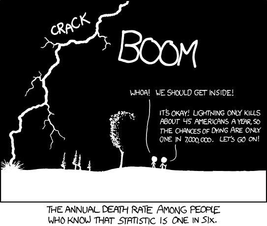
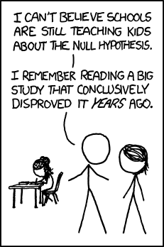
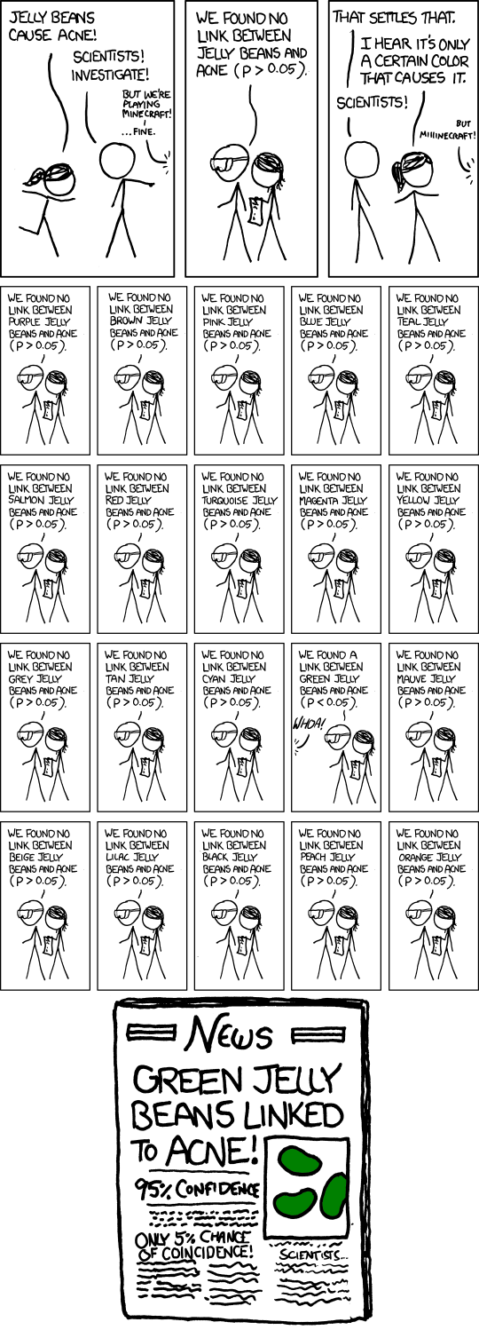
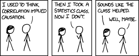
For today's post, I've decided to start pulling together XKCD cartoons corresponding to statistics/probability concepts. Why? Because there are some great ones that will liven up your presentation or lecture. Much like the Free Data Science and Statistics Resources post, this is going to be a living document.

Probability


Outliers

Hypothesis Testing

Null


P-Hacking:


Correlation


Randomness


Visualizing Data


Other Concepts


Wednesday, February 7, 2018

Statistical Sins: Olympic Figure Skating and Biased Judges

The 2018 Winter Olympics are almost here! And, of course, everyone is already talking about the events that have me as mesmerized as the gymnasts in the Summer Olympics - figure skating.

Full confession: I love figure skating. (BTW, if you haven't yet seen I, Tonya, you really should. If for no other reason than Margot Robbie and Allison Janney.)

In fact, it seems everyone loves figure skating, so much that the sport is full of drama and scandals. And with the Winter Olympics almost here, people are already talking about the potential for biased judges.

We've long known that ratings from people are prone to biases. Some people are more lenient while others are more strict. We recognize that even with clear instructions on ratings, there is going to be bias. This is why in research we measure things like interrater reliability, and work to improve it when there are discrepancies between raters.

And if you've peeked at the current International Skating Union (ISU) Judging System, you'll note that the instructions are quite complex. They say the complexity is designed to prevent bias, but when one has to put so much cognitive effort into understanding something so complex, they have less cognitive energy to suppress things like bias. (That's right, this is a self-regulation and thought suppression issue - you only have so many cognitive resources to go around, and anything that monopolizes them will leave an opening for bias.)

Now, bias in terms of leniency and severity is not the real issue, though. If one judge tends to be more harsh and another tends to be more lenient, those tendencies should wash out thanks to averages. (In fact, total score is a trimmed mean, meaning they throw out the highest and lowest scores. A single very lenient judge and a single very harsh judge will then have no impact on a person's score.) The problem is when the bias emerges with certain people versus others.

At the 2014 Winter Olympics, the favorite to win was Yuna Kim of South Korea, who won the gold at the 2010 Winter Olympics. She skated beautifully; you can watch here. But she didn't win the gold, she won the silver. The gold went to Adelina Sotnikova of Russia (watch her routine here). The controversy is that, after her routine, she was greeted and hugged by the Russian judge. This was viewed by others as a clear sign of bias, and South Korea complained to the ISU. (The complaints were rejected, and the medals stood as awarded. After all, a single biased judge wouldn't have gotten Sotnikova such a high score; she had to have high scores across most, if not all, judges.) A researcher interviewed for NBC news conducted some statistical analysis of judge data and found an effect of judge country-of-origin:


As a psychometrician, judge ratings are a type of measurement, and I personally would approach this issue as a measurement problem. Rasch, the measurement model I use most regularly these days, posits that an individual's response to an item (or, in the figure skating world, a part of a routine) is a product of the difficulty of the item and the ability of the individual. If you read up on the ISU judging system (and I'll be honest - I don't completely understand it but I'm working on: perhaps for a Statistics Sunday post!), they do address this issue of difficulty in terms of the elements of the program: the jumps, spins, steps, and sequences skaters execute in their routine.

There are guidelines as to which/how many of the elements must be present in the routine and they are ranked in terms of difficulty, meaning that successfully executing a difficult element results in more points awarded than successfully executing an easy element (and failing to execute an easy element results in more points deducted than failing to execute a difficult element).

But a particular approach to Rasch allows the inclusion of other factors that might influence scores, such as judge. This model, which considers judge to be a "facet," can model judge bias, and thus allow it to be corrected when computing an individual's ability level. The bias at issue here is not just overall; it's related to the concordance between judge home country and skater home country. This effect can be easily modeled with a Rasch Facets model.

Of course, part of me feels the controversy at the beginning of the NBC article and video above is a bit overblown. The video fixates on an element Sotnikova blew - a difficult combination element (triple flip-double toe-double loop) she didn't quite execute perfectly. (She did land it though; she didn't fall.)

But the video does not show the easier element, a triple Lutz, that Kim didn't perfectly execute. (Once again, she landed it.) Admittedly, I only watched the medal-winning performances, and didn't see any of the earlier performances that might have shown Kim's superior skill and/or Sotnikova's supposed immaturity, but I could see, based on the concept of element difficulty, why one might have awarded Sotnikova more points than Kim, or at least, have deducted fewer points for Sotnikova's mistake than Kim's mistake.

In a future post, I plan to demonstrate how to conduct a Rasch model, and hopefully at some point a Facets model, maybe even using some figure skating judging data. The holdup is that I'd like to demonstrate it using R, since R is open source and accessible by any of my readers, as opposed to the proprietary software I use at my job (Winsteps for Rasch and Facets for Rasch Facets). I'd also like to do some QC between Winsteps/Facets and R packages, to check for potential inaccuracies in computing results, so that the package(s) I present have been validated first.

Wednesday, January 31, 2018

Statistical Sins: Types of Statistical Relationships

On this blog, I've covered a lot of statistical topics, and have tried to make them approachable even to people with little knowledge of statistics. But I admit that, recently, I've been covering more advanced topics. But there are still many basic topics to explore, that could be helpful for non-statistical readers, as well as teachers of statistics who address these topics in courses. This topic was prompted by a couple of discussions - one late last week, and another at dance class last night.

The discussions dealt with what it means to say two variables are related to each other (or not), including whether that relationship is weak, moderate, or strong, and whether it is positive or negative. I first addressed this topic when I wrote about correlation for my 2017 April A to Z. But let's really dive into that topic.

You may remember that correlation ranges from -1 to +1. The closer the value is to 1 (positive or negative), the stronger the relationship between the two variables. So in terms of strength, it is the absolute value that matters. A correlation close to 0 indicates no relationship between the variables.

A common question I see is whether a correlation is weak, moderate, or strong. Different people use different conventions, and there isn't a lot of agreement on this topic, but I frequently see a correlation of 0.5 referred to as strong. As I explained in my post on explained variance, this means the two variables share about 25% variance, or more specifically, about 25% of the variation in one variable can be explained by the other variable.

For moderate, I often see 0.3 (or 9% shared variance) and for weak, 0.1 (or 1% shared variance). But as I said, these really aren't established conventions (please don't @ me - thanks in advance). You could argue that there are a variety of factors that influence whether a relationship is seen as weak, moderate, or strong. For instance, study methods could have an impact. Finding a correlation of 0.5 between two variables I can directly manipulate and/or measure in an experimental setting is completely different from finding a correlation of 0.5 between two variables simply measured in a natural setting, where I have little to no control over confounds and high potential for measurement error. And we are often more generous about what we consider strong or weak in new areas of research than in well-established topics. But conventions give you a nice starting point, that you can then shift as needed depending on these other factors.

Direction of the relationship is indicated by the sign. A positive correlation means a positive relationship - as scores on one variable go up, so do scores on the other variable. For example, calories consumed per day and weight would be positively correlated.

A negative correlation means a negative relationship - as scores on one variable go up, scores on the other variable go down. For instance, minutes of exercise per day and weight would probably have a negative correlation.

[Now, for that last relationship, you might point out that there are a variety of other factors that could change that relationship. For example, some exercises burn fat, lowering weight, while others build muscle, which might increase weight. I hope to explore this topic a bit more later: how ignoring subgroups in your data can lead you to draw the wrong conclusions.]

Part of the confusion someone had in our discussion last night was knowing the difference between no relationship and a negative relationship. That is, they talked about how one variable (early success) had no bearing on another variable (future performance). They quickly pointed that this doesn't mean having early success is bad - the relationship isn't negative. But I think there is a tendency for people unfamiliar with statistics to confuse "non-predictive" with "bad".

So let's demonstrate some of these different relationships. To do that, I've generated a dataset in R, using the following code to force the dataset to have specific correlations. (You can use the code to recreate on your own.) The first thing I do is create a correlation matrix, which shows the correlations between each pairing of variables, that reflect a variety of relationship strengths and directions. Then, I impose that correlation matrix onto a randomly generated dataset. Basically R generates data that produces a correlation matrix very similar to the one I defined.

R1 = c(1,0.6,-0.5,0.31,0.11)
R2 = c(0.6,1,-0.39,-0.25,0.05)
R3 = c(-0.5,-0.39,1,-0.001,-0.09)
R4 = c(0.31,-0.25,-0.001,1,0.01)
R5 = c(0.11,0.05,-0.09,0.01,1)

R = cbind(R1,R2,R3,R4,R5)
U = t(chol(R))
nvars = dim(U)[1]
numobs = 1000
set.seed(36)
random.normal = matrix(rnorm(nvars*numobs,0,1),nrow = nvars, ncol=numobs)
X = U %*% random.normal
newX = t(X)
raw = as.data.frame(newX)
names(raw) = c("V1","V2","V3","V4","V5")
cor(raw) 


The final command, cor, which requests a correlation matrix for the dataset, produces the following:

           V1          V2         V3          V4          V5
V1  1.0000000  0.57311834 -0.4629099  0.31939003  0.10371136
V2  0.5731183  1.00000000 -0.3474012 -0.26425660  0.04838563
V3 -0.4629099 -0.34740123  1.0000000  0.01204920 -0.12017036
V4  0.3193900 -0.26425660  0.0120492  1.00000000  0.01202121
V5  0.1037114  0.04838563 -0.1201704  0.01202121  1.00000000

Just looking down the columns, you can see that the correlations are very close to what I specified. The one exception is the correlation between V3 and V4 - I asked for -0.001 and instead have 0.012. Probably, R couldn't figure out how to generate data with that correlation while also coming close to the other values I specified. So it had to fudge this one a bit.

So now, I can plot these different relationships in scatterplots, to let you see what weak, moderate, and strong relationships look like, and how direction changes the appearance. Let's start by looking at our weak correlations, positive and negative. (Code below, including lines to add a title and center it.)

library(ggplot2)

weakpos<-ggplot(raw,aes(x=V1,y=V5)+geom_point()
+labs(title="Weak Positive")
+theme(plot.title=element_text(hjust=0.5))

weakneg<-ggplot(raw,aes(x=V3,y=V5)+geom_point()
+labs(title="Weak Negative")
+theme(plot.title=element_text(hjust=0.5))

That code produces these two plots:


With similar code (just switching out variables in the x= and y= part), I can produce my moderate plots:


and my strong plots:

As you can see, even a strong relationship looks a bit like a cloud of dots, but you can see trends that go from almost nonexistent to more clearly positive or negative. You can make the trends a bit easier to spot by adding a trendline. For example:

strongpos+geom_smooth(method=lm)


The flatter the line, the weaker relationship. Two variables that are unrelated to each other (such as V4 and V5) will have a horizontal line through the scatter:


I'll come back to this topic Sunday (and in the future post idea I mentioned above), so stay tuned!

Wednesday, January 24, 2018

Statistical Sins: Facebook's Search for Trustworthy News Sources

You're heard the story already: fake news - actual fake news, and not just what Trump calls fake news - has been propagating on social media networks. I've encountered so much in my networks, I've begun using Snopes as a verb. E.g., "Can you Snopes this, please?" In fact, fake news may have had real-world consequences, perhaps even influencing the results of elections.

Fake news has been able to propagate, not simply because of people who spread what they knew to be fake, but because many (likely well-meaning) people bought it and shared it.

Which is why Facebook's response to this issue is so ridiculous:
Last week, Facebook said its News Feed would prioritize links from publications its users deemed "trustworthy" in an upcoming survey. Turns out that survey isn't a particularly lengthy or nuanced one. In fact, it's just two questions.

Here is Facebook's survey — in its entirety:

Do you recognize the following websites

  • Yes
  • No

How much do you trust each of these domains?

  • Entirely
  • A lot
  • Somewhat
  • Barely
  • Not at all

A Facebook spokesperson confirmed this as the only version of the survey in use. They also confirmed that the questions were prepared by the company itself and not by an outside party.
That's right, Facebook intends to protect people from fake news by asking the very people who helped spread that news what sources they find trustworthy. Do you see the problem with this scenario? Because the leadership at Facebook certainly doesn't.

Yesterday evening, I went to my first meeting of an advisory board for an applied psychology accelerated bachelors program for adult learners. During that meeting, we were asked what skills and knowledge would be essential for someone coming out of such a program. One of my responses was that, a skillset from my training I've had to use in every job and many of volunteer experiences has to do with creating and fielding surveys. There is an art and a science to surveying people, and there are ways to write questions that will get useful data - and ways that will get you garbage. Facebook's survey is going to give them garbage.

Even if you forget about the countless people who, every day, mistake well-known satirical news sites (like the Onion) as genuine, not every site is clear on whether it is purporting itself to be real news or simply entertainment - and let's be honest, where do you draw that line between informing and entertaining? How do you define something as trustworthy or not? And how might variation in how people define that term influence your data? Many year ago, when Jon Stewart was still on The Daily Show, I remember a commercial in which they shared that more Americans get their news from The Daily Show than anywhere else, to which Stewart replied, "Don't do that! We make stuff up!" Even though they were forthcoming about this, people still considered them trustworthy.

The real issue is when people can't tell the difference. So now you're fixing a problem caused by people being unable to tell the difference by asking people to tell the difference. At best, the survey will produce such inconsistent data, it won't have any influence on what links can and can't be shared. At worst, the same biases that caused fake news to be shared to begin with will be used to deem sites trustworthy or not. And having the Facebook stamp of trustworthy could result in even more harm.

Honestly, information campaigns to make people more skeptical would be a much better use of Facebook's time and resources.

Thursday, January 18, 2018

Statistical Sins: Data Dictionaries and Variable Naming Conventions

Before I started at DANB, the group fielded a large survey involving thousands of participants from throughout the dental profession. My job the last few weeks has been to dig through this enormous dataset, testing some planned hypotheses.

Because the preferred statistical program with my coworkers is SPSS, the data were given to me in an SPSS file. The nice thing about this is that one can easily add descriptive text for each variable, predefine missing values, and label factors. But this can also be a drawback, when the descriptive text is far too long and used to make up for nonintuitive variable names. As is the case with this dataset.

That is, in this dataset, the descriptive text is simply the full item text from the survey, copied and pasted, making for some messy output. Even worse, when the data were pulled into SPSS, each variable was named Q followed by a number. Unfortunately, there are many variables in here that don't align to questions, but they were still named in order. This makes the Q-numbering scheme meaningless. Responses for question 3 in the survey are in the variable, Q5, for instance. Unless you're using descriptive variable names (e.g., data from the question about gender is called "gender"), numbering schemes become unwieldy unless they can be linked to something, such as item number on a survey. It's tempting to skip the step of naming each variable when working with extremely large datasets, but it's when datasets are large that intuitive naming conventions are even more necessary.

I'm on a tight schedule - hence this rushed blog post - so I need to push forward with analysis. (I'm wondering if that's what happened with the last person, too, which would explain the haphazard nature of the dataset.) But I'm seriously considering stopping analysis so I can pull together a clear data dictionary with variable name, shorter descriptive text, and in sample order instead than overall survey order. There are also a bunch of new items the previous analyst generated that don't look all that useful for me and make the dataset even more difficult to work with. At the very least, I'm probably going to pull together an abbreviated dataset that removes these vestigial variables.

Thursday, January 11, 2018

Statistical Sins: Unclear Terms

Though I'm a psychometrician/statistician in my job, I've been dipping my toe into the pool of data science, so I've blogged about data science and the related topics. In fact, one such post resulted in a lively discussion on Facebook about what data science is exactly.

I mostly remained a voyeur to this discussion. I don't see anything wrong with stepping back and listening to what others think, rather than always jumping in with my opinion.

But, I've still committed a sin in that I've used terms like data science, machine learning, and artificial intelligence in rather unclear, even sloppy ways. Fortunately, David Robinson of Variance Explained is here to save the day! So in lieu of my own statistical sins posts for the day, I'm calling myself out and recommending you read David's awesome post on the difference among these three terms.

As for me, I'm working on pulling together a dataset on reading habits of my Goodreads friends from 2017 - a dataset I started on a sleepless night earlier this week. I'm just about ready to start analyzing it. Stay tuned for some fun analyses! (But one thing I've already learned is that the most read book among my friends in 2017 was The Handmaid's Tale.)

Wednesday, January 3, 2018

Statistical Sins: Junk Science

This isn't exactly a statistical sin, but it's probably one of the worst sins against science - buying into garbage that, even worse than being of no help, might actually kill you. It's a sign of how comfortable many in our society have become, being free from worry about life-threatening illnesses, that they begin to wonder if the things that are keeping us alive and healthy are of any use at all.

We've seen this happening for a while with vaccinations. And now, it's happening with water:
In San Francisco, "unfiltered, untreated, unsterilized spring water" from a company called Live Water is selling for up to $61 for a 2.5-gallon jug — and it's flying off the shelves, The New York Times reported.

Startups dedicated to untreated water are also gaining steam. Zero Mass Water, which allows people to collect water from the atmosphere near their homes, has already raised $24 million in venture capital, the report says.

However, food-safety experts say there is no evidence that untreated water is better for you. In fact, they say that drinking untreated water could be dangerous.

"Almost everything conceivable that can make you sick can be found in water," one such expert, Bill Marler, told Business Insider. That includes bacteria that can cause diseases or infections such as cholera, E. coli, hepatitis A, and giardia.
In a world where 884 million people do not have access to clean water, rich people in California (and elsewhere) are paying hundreds of dollars for water that could make them sick or even kill them. Perhaps the most telling quote from the article is this one, from Bill Marler:
"You can't stop consenting adults from being stupid," Marler said. "But we should at least try."
In fact, there are a variety of explanations for why people might buy into such junk science. Not only the comfort of never having to worry about a cholera epidemic or seeing firsthand the complications of polio, but also the use of vague euphemisms, like "raw water." The price tag might also be an indicator of quality. I remember hearing a story (possibly apocryphal) about Häagen-Dazs, that it was originally less expensive with a more generic name. But when they changed the name to Häagen-Dazs and increased the price, it started flying off the shelves. Obviously, getting a celebrity or someone of influence on board can also help something take off.

Still, it's fascinating to me how some of this junk science proliferates. The pattern of diffusion for innovations is well-known, and while we know that not every innovation will take off (like the Dvorak keyboard), innovations are by their nature things that make our lives better/easier, and the ones that take off are likely the ones with the best marketing. But junk science is absolutely not an innovation, and in some cases, they make our lives worse or harder. How, then, do we explain some of the nonsense that continues to influence people's behavior? What sorts of outcomes does it take before people see the error of their ways?

Wednesday, December 20, 2017

Statistical Sins: Algorithmic Bias

Many aspects of modern life are determined by algorithms. When you apply for a job, chances are it's not a person who first sees your resume and cover letter; there's an algorithm for that. Algorithms can also dictate who gets additional security screening (or who gets assigned to have less scrutiny, as happened to me once when flying back to Chicago), or whether an email goes to your inbox or straight to your spam folder. They help make our lives more efficient.

But they can also cause harm. Since algorithms are, by nature, designed to work without human intervention (in fact, that's their entire purpose), that also means if there's a problem with the algorithm, it might not be spotted until multiple negative outcomes have already occurred.

Though there is evidence that algorithms - even when they show bias - are far superior to human decision-making, people often feel more comfortable knowing that a person, and not a computer, made a decision. For instance, I briefly worked on research for a new masters program. Since we had so many qualified candidates, many admission decisions were made by lottery. But because of past negative responses from the people who weren't chosen for other programs, this information was not widely known. In my current job, where scoring of exams is done by computer, we still do some quality control by hand, to make sure nothing went wrong - and this is viewed as essential by examinees and accreditors, especially in cases of high stakes testing. So it seems very likely that people might perceive decisions made by algorithms as unfair, and decisions made by people as more fair, even when they're not.

At the same time, there may be bias in variables measured and selected for algorithms, because at some point, that decision was made by a person. And algorithms that perpetuate discrimination can result in an endless feedback loop or a sort of self-fulfilling prophecy.

This may be the reason that New York City recently passed a bill to examine algorithmic bias in city government agencies:
The bill, which was signed by Mayor Bill de Blasio last week, will assign a task force to examine the way that New York City government agencies use algorithms to aid the judicial process.

According to ProPublica, council member James Vacca sponsored the bill as a response to ProPublica's 2016 account of racially-biased algorithms in the American criminal justice system. The investigative story revealed systemic digital bias within judicial risk assessment programs that favored the release of white inmates on the grounds of future good behavior over the release of black defendants.

Algorithmic source code is typically private, but issues of bias have called for increased transparency. The ACLU has spoken out on behalf of the bill passing, and it described access to institutionalized algorithmic source code as a fundamental step in ensuring fairness within the criminal justice system.
What are your thoughts on this issue? Should we always follow the algorithm's data driven decisions, even when those decisions are biased against a certain group? Or should we allow human intervention, even when that risks introducing more bias?