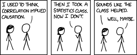
BTW, my favorite correlation-related cartoon:
There are different statistics that measure correlation, but the best known is Pearson's correlation coefficient, also known as r. This statistic, which is used when you have two interval or ratio variables, communicates a great deal of information:
- Strength of the relationship: r ranges from -1 to +1; scores of
+/- 1 indicate a perfect relationship, while scores of 0 indicate no relationship - Direction of the relationship: positive values indicate a positive relationship, where as one variable increases so does the other; negative values indicate a negative or inverse relationship, where as on variable increases the other decreases
Here's a demonstration of that concept. I created 20 samples of 30 participants measured on two randomly generated continuous variables. Because these are randomly generated, they should not be significantly correlated other than by chance alone. I then computed correlation coefficients for each of these samples. If you recall from the alpha post, with an alpha of 0.05, we would expect at least 1 of 20 to be significant just by chance. It could be more or less, because, well, probability. It's a 5% chance each time, just like you have a 50% chance of heads each time you flip a coin - you could still get 10 heads in a row. And you could figure out the probability of getting multiple significant results just by chance in the same way as you would multiple heads in a row: with joint probability.
The results? 3 were significant.
BTW, using joint probability, the chance of having 3 significant results in this situation was 0.0125%. Small, but not 0.
Tomorrow I'll talk about how we visualize these relationships.


No comments:
Post a Comment