Saturday, September 30, 2017

Saturday Video Roundup: Bad Books, Space Ghosts, and Dog Islands

It's been a long week, so today I've been enjoying some funny videos. First of all, the hilarious Jenny Nicholson has been on a mission to find the worst book on Amazon - and I think she succeeded:


Honest Trailers did Star Trek: The Next Generation, and I spent the entire time watching the video laughing and/or saying, "OMG, I remember that episode!":


Finally, I discovered this movie, that I DEFINITELY have to see:


BTW, if the trailer itself doesn't convince you, check out that cast.

Friday, September 29, 2017

Just You Wait: Hamilton, Madison, and the Federalist Papers

Completely by accident, the last book I read and the one I'm about to finish have a common story - a study in the 1950s and 1960s that attempted to answer the question: who wrote the 12 Federalist Papers with disputed authorship, Alexander Hamilton or James Madison? First, some background, if you're not familiar with any of this.

By Publius (pseudonym) [Alexander Hamilton, John Jay, James Madison]. - http://www.americaslibrary.gov/aa/madison/aa_madison_father_2_e.html., Public Domain, Link
In 1787 and 1788, a series of 85 essays, collectively known as "The Federalist" or "The Federalist Papers," were published under the pseudonym, Philo-Publius. These essays were intended to support ratifying the Constitution, and influence that voting process. It was generally known that the essays were written by three Founding Fathers: Alexander Hamilton, the 1st US Secretary of the Treasury; John Jay, the 1st Chief Justice of the US Supreme Court; and James Madison, 5th US Secretary of State and 4th US President. The question is, who wrote which ones?

The authorship was not in question for 73 of the essays; each of these essays had a unique member of the trio claiming authorship in the form of a list shared with the public later (in some cases, following the individual's death). The problem is that for 12 essays, both Hamilton and Madison claimed authorship.

Historians have debated this issue for a very long time. In the 1950s, two statisticians, Frederick Mosteller and David L. Wallace, decided to tackle the problem with data: the words themselves. I learned about the study, which produced an article (available here) and a book, first in Nabokov's Favorite Word is Mauve. In fact, that was Ben Blatt's inspiration for book, which involved analysis of the word usage patterns (as well as a few other interesting analyses) of literary and mainstream fiction.

But it was through the book I'm reading now that I learned their approach was Bayesian. I've written about Bayes theorem (and twice more). Its focus is on conditional probability - the probability one thing will happen given another thing has happened. Bayesian statistics, or what's sometimes called Bayesian inference, uses these conditional probabilities, and allows analysts to draw upon other previously collected probabilities (called priors) that may be subjective (e.g., expert opinion, equal odds) or empirically based. Those prior probabilities are then used with the observed data to derive a posterior probability. Bayes was frequently used by cryptanalysts, including the code breakers at Bletchley Park (such as Alan Turing) who broke the Enigma code.

Mosteller and Wallace started off with subjective priors - they went in with the prior that each of the 12 disputed essay was equally likely to have been written by Hamilton or Madison. Then, they set out analyzing the known essays for word usage patterns. This also provided prior probabilities. They found that Madison used 'whilst' and Hamilton used 'while.' Hamilton used 'enough' but Madison never did. They then examined the disputed essays, using these word usage patterns to test alternative scenarios: This essay was written by Madison versus This essay was written by Hamilton. They found that, based on word usage patterns, the 12 essays were written by Madison, meaning Madison wrote 29 of the essays. This still leaves Hamilton with a very impressive 51.

Overall, I highly recommend checking out The Theory that Would Not Die. I'll have a full review on Goodreads once I read the last 20 or so pages. And I think I'm ready to finally tackle learning Bayesian inference. I already have a book on the subject.

Thursday, September 28, 2017

Wear Your Best Pant Suit

File this under awesome:

Statistical Sins: Nicolas Cage Movies Are Making People Drown and More Spurious Correlations

As I posted yesterday, I attended an all-day data science conference online. I have about 11 pages of typed notes and a bunch of screenshots I need to weed through, but I'm hoping to post more about the conference, my thoughts and what I learned, in the coming days.

At work, I'm knee-deep in my Content Validation Study. More on that later as well.

In the meantime, for today's (late) Statistical Sins, here's a great demonstration of why correlation does not necessarily infer anything (let alone causation). I can't believe I didn't discover this site before now: Spurious Correlations. Here are some of my favorites:


As I mentioned in a previous post, a correlation - even a large correlation - can be obtained completely by chance. Statistics are based entirely on probabilities, and there's always a probability that we can draw the wrong conclusion. In fact, in some situations, that probability may be very high (even higher than our established Type I error rate). 

This is a possibility we always have to accept; we may conduct a study and find significant results completely by chance. So we never want to take a finding in isolation too seriously. It has to be further studied and replicated. This is why we have the scientific method, which encourages transparency of methods and analysis approach, critique by other scientists, and replication.

But then there's times we just run analyses willy-nilly, looking for a significant finding. When it's done for the purpose of the Spurious Correlation website, it's hilarious. But it's often done in the name of science. As should be demonstrated above, we must be very careful when we go fishing for relationships in the data. The analyses we use will only tell us the likelihood we would find a relationship of that size by chance (or, more specifically, if the null hypothesis is actually true). It doesn't tell us if the relationship is real, no matter how small the p-value. When we knowingly cherry pick findings and run correlations at random, we invite spurious correlations into our scientific undertaking. 

This approach violates a certain kind of validity, often called statistical conclusion validity. We maximize this kind of validity when we apply the proper statistical analyses to the data and the question. Abiding by the assumptions of the statistic we apply is up to us. The statistics don't know. We're on the honor system here, as scientists. Applying a correlation or any statistic without any kind of prior justification to examine that relationship violates assumptions of the test.

So I'll admit, as interested as I am in the field of data science, I'm also a bit concerned about the high use of exploratory data analysis. I know there are some controls in place to reduce spurious conclusions, such as using separate training and test data, so I'm sure as I find out more about this field, I'll become more comfortable with some of these approaches. More on that as my understanding develops.

Wednesday, September 27, 2017

Data Science Today, Statistical Sins Tomorrow

Hi all! I'm attending an all-day data science conference, so I won't be able to post my regular Statistical Sins post. Check back tomorrow! In the meantime, here's my new favorite quote I learned through the conference:
"Statistical thinking will one day be as necessary for efficient citizenship as the ability to read and write."

--H.G. Wells

Tuesday, September 26, 2017

Banned Books Week: What Will You Be Reading?

September 24-30 is Banned Books Week.

Alison Flood of The Guardian explains:
[Banned Books Week] was launched in the US in 1982, to mark what the American Library Association (ALA) said was a sudden surge in attempts to have books removed or restricted in schools, bookshops and libraries. Since then, more than 11,300 books have been “challenged”, with last year’s most controversial title the award-winning graphic novel This One Summer by Mariko and Jillian Tamaki – “because it includes LGBT characters, drug use and profanity, and it was considered sexually explicit with mature themes,” said the ALA.

Almost all of the books on its annual list of challenged books are picture books and young adult novels, flagged because of sexual content, transgender characters or gay relationships. The only exception on this year’s list, the Little Bill series, was challenged because of the high-profile sexual harassment claims against their author, comedian Bill Cosby.
The Banned Books Week website offers many resources, including where to celebrate.

What will you be reading?

Monday, September 25, 2017

Conductor's Notes

When I'm not working or writing about statistics, I'm singing with the Apollo Chorus of Chicago. (I also serve on the board as Director of Marketing.) Last week, our PR Director sat down with Music Director, Stephen Alltop, to discuss our upcoming season.


Our first concert is at 2:30pm on Sunday, November 5th, at Holy Family Church in Chicago. Admission is FREE! So if you're in the Chicago-area, come check us out!

Sunday, September 24, 2017

Statistics Sunday: What is a Content Validation Study?

I've been a bit behind on blogging this week because we're starting up a content validation study for multiple exams at work. A content validation study is done to ensure the topics on a measure are relevant to the measure subject - basically we want to make sure we have all the content we should have (relevant content) and none of the content we shouldn't have (irrelevant content). For instance, if you were developing the new version of the SAT, you'd want to make sure that everything on the quantitative portion is relevant to the domain (math) and covers all the aspects of math that are important for a person going from high school to college.

For certification and licensing exams, the focus is on public safety. What tasks or knowledge are important for this professional to know in order to protect the public from harm? That helps narrow down the potential content. From there, we have many different approaches to find out what topics are important.

The first potential way is bringing in experts: people who have contributed to the knowledge base in that field, perhaps as an educator or researcher, or someone who has been in a particular field for a very long time. There are many potential ways to get information from them. You could interview them one-on-one, or have a focus group. You could use some of the more formal consensus-building approaches, like a Delphi panel. Or you could bring your experts in at different stages to influence and shape information obtained from another source.

Another potential way is to collect information on how people working in the field spend their time. This approach is often known as job analysis. Once again, there are many ways you can collect that information. You can shadow and observe people as they work, doing a modified version of a time-motion study. You could conduct interviews or focus groups with people working in the field. Or you could field a large survey, asking people to rate how frequently they perform a certain task and/or how essential it is to do that task correctly.

A related approach is to examine written materials, such as job descriptions, to see what sorts of things a person is expected to know or do as part of the job.

Of course, content validation studies are conducted for a variety of measures, not just exams. When I worked on a project in VA to develop a measure of comfort and tolerability of filtering respirator masks, we performed a multi-stage content validation study, using many of the approaches listed above. First, we checked the literature to see what research has been performed on comfort (or rather, discomfort) with these masks. We found that studies had shown people experienced things like sweaty faces and heat buildup, with some extreme outcomes like shortness of breath and claustrophobia. We created a list of everything we found in the literature, and wrote open-ended questions about them. Then, we used these questions to conduct 3 focus groups with healthcare workers who had to wear these masks as part of their jobs - basically anyone who works with patients in airborne isolation.

These results were used to develop a final list of symptoms and reactions people had as a result of wearing these masks, and we started writing questions about them. We brought in more people at different stages of the draft to look at what we had, provide their thoughts on the rating scales we used, and tell us whether we had all the relevant topics covered on the measure (that is, were we missing anything important or did we have topics that didn't fit?). All of these approaches help to maximize validity of the measure.

This is an aspect of psychometrics that isn't really discussed - the importance of having a good background in qualitative research methods. Conducting focus groups and interviews well takes experience, and being able to take narratives from multiple people and distill them down to key topics can be challenging. A knowledge of survey design is also important. There's certainly a methodological side to being a psychometrician - something I hope to blog about more in the future!

Saturday, September 23, 2017

Today's Google Doodle Honoring Asima Chatterjee

Today would have the 100th birthday of Dr. Asima Chatterjee, the first Indian woman to earn a doctorate of science (Sc.D.) from an Indian university. And she's being honored in one of today's Google Doodles.

Wikipedia/Creative Commons, Fair use, Link
In fact, she broke the glass ceiling in many ways:
Despite resistance, Chatterjee completed her undergraduate degree in organic chemistry and went on to win many honours including India’s most prestigious science award in 1961, the annual Shanti Swarup Bhatnagar Prize for her achievements in phytomedicine. It would be another 14 years before another woman would be awarded it again.

According to the Indian Academy of Sciences, Chatterjee “successfully developed anti-epileptic drug, Ayush-56 from Marsilia minuta and the anti-malarial drug from Alstonia scholaris, Swrrtia chirata, Picrorphiza kurroa and Ceasalpinna crista.”

Her work has contributed immensely to the development of drugs that treat epilepsy and malaria.

She was elected as the General President of the Indian Science Congress Association in 1975 – in fact, she was the first woman scientist to be elected to the organisation.

An outstanding contribution was her work on vinca alkaloids, which come from the Madagascar periwinkle plant. They are used in chemotherapy to assist in slowing down and halting cancer cells duplicating.
There are actually 2 Google Doodles today. The other celebrates Saudi Arabia National Day.

Friday, September 22, 2017

Statistical Sins Late Edition: Looking for Science in All the Wrong Places

Recently, the Pew Research Center released survey results on where people look for and how they evaluate science news.

First, some good news. About 71% of respondents said they found science news somewhat or very interesting, and 66% read science news at least a few times per month. Curiosity is the primary reason people said they attend to science news.

And more good news. People recognize that the general media is not a great place to science news, with 62% believing it gets science information correct about half the time (or less).

The bad news? Over 54% said general news is where they tend to get science information. And worse - most (68%) don't actively seek science news out, instead just encountering it by chance.


What does it say that the typical respondent gets their science news from a source they know can be very inaccurate and biased?

And as we've observed before with other topics, many beliefs about science and science reporting have become entangled with political ideology, with people considering themselves a republican less interested in scientific research on evolution, and also more likely to believe that science researchers overstate the implications of their research.

This suggests that not only is it important to improve scientific literacy, it's also important for people with a good understanding of science to share and disseminate science news and information with the public. Most people are not going to seek out better sources, so even if they know the usual suspects are biased, they're still only seeing those sources. And it's possible that, even though they recognize the bias, the sources they're encountering are even more biased than they think. While we can't make anyone trust a source, we can at least give them the tools and sources they need to hear (and hopefully understand) the full story.

You can read the full report, with frequencies of responses, here.

Thursday, September 21, 2017

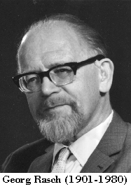
Great Minds in Statistics: Georg Rasch

Happy birthday, Georg Rasch, who would have been 116 today! Rasch was a Danish mathematician who contributed a great deal to statistics, and specifically a branch of statistics known as psychometrics. In fact, his most important contribution bears his name - the Rasch measurement model, which is a model that we use to analyze measures of ability (and later, other characteristics like personality).


Explaining everything about the Rasch model and using it to analyze measurement data would take more blog posts than this one. (Don't worry, reader, I'm planning a series of posts.) But my goal for today is to explain the basic premise and tie it to things I've blogged about previously.

The Rasch model was originally developed for ability tests, where the outcomes are correct (1) or incorrect (0). Remember binary outcomes? This is one of those instances where the raw scale is both binary and ordinal. But you don't use items in isolation. You use them as part of a measure: the SAT, the GRE, a cognitive ability test.

So you might argue the outcome is no longer ordinal. It's the total number of correct answers. But not all items are created equal. Some items are easier than others. And for adaptive exams, which determine the next item to administer based on whether the previous item was answered correctly, you need to take into account item difficulty to figure out a person's score.

Adding a bunch of ordinal variables together doesn't necessarily mean you have a continuous variable. That final outcome could also be ordinal.

Rasch developed a logarithmic model that converts ordinal scales to interval scales. Each individual item now has an interval scale measure, and overall score (number of items correct) also has an interval scale. It does this by converting to a scale known as logits, which are log odds ratios. Item difficulty (the interval scale for items) and person ability (the interval scale for overall score) are placed on the same metric, so that you can easily determine whether a person will respond to a certain item correctly. If your ability, on the Rasch scale, is a logit of 1.5, that means an item of difficulty 1.5 on the Rasch scale is perfectly matched to your ability.

What does that mean in practice? It means you have a 50% chance of responding correctly to that item. That's how person ability is typically determined in the Rasch model; based on the way you respond to questions, your ability becomes the difficulty level where you answer about half the questions correctly.

Even better, if I throw an item of difficulty 1.3 at you, you'll have a better than 50% chance of responding.

But I can be even more specific about that. Why? Because these values are log odds ratios and there's a great reason person ability and item difficulty are on the same scale. First, I subtract item difficulty (which we symbolize as D) from your ability level (which we symbolize as B): B-D = 1.5-1.3. The resulting different (0.2) is also a log odds ratio. It is the log transformation of the odds ratio that a person of B ability will answer an item of D difficulty correctly. I convert that back to a proportion, to get the probability that you will answer the item correctly, using this equation:


where P(X=1) refers to the probability of getting an item correct. This equation is slightly different from the one I showed you in the log odds ratio post (which was the natural number e raised to the power of the log odds ratio). Remember that equation was to convert a log odds ratio back to an odds ratio. This equation includes one additional step to convert back to a proportion.

If I plug my values into this equation, I can tell that you have a 55% chance of getting that question correct. This is one of the reasons the Rasch model does beautifully with missing data (to a point); if I know your ability level and the difficulty level of an item, I can compute how you most likely would have responded.

Stay tuned for more information on Rasch later! And be sure to hug a psychometrician today!

Monday, September 18, 2017

Words, Words: From the Desk of a Psychometrician

I've decided to start writing more about my job and the types of things I'm doing as a psychometrician. Obviously, I can't share enough detail for you to know exactly what I'm working on, but I can at least discuss the types of tasks I encounter and the types of problems I'm called to solve. (And if you're curious what it takes to be a psychometrician, I'm working on a few posts on that topic as well.)

This week's puzzle: examining readability of exam items. Knowing as much as we do about the education level of our typical test-taker - and also keeping in mind that our exams are supposed to measure knowledge of a specific subject matter, as opposed to reading ability - it's important to know how readable are the exam questions. This information can be used when we revise the exam, and could also be used to update our exam item writing guides (creating a new guide is one of my ongoing projects).

Anyone who has looked at the readability statistics in Word knows how to get Flesch-Kinkaid statistics: reading ease and grade level. Reading ease, which was developed by Rudolph Flesch, is a continuous value based on the average number of words per sentence and average number of syllables per word; higher scores mean the text is easier to read. The US Army, led by researcher John Kinkaid, created grade levels based on the reading ease metric. So the grade-level you receive through your analysis reflects the level of education necessary to comprehend that text.

And to help put things in context, the average American reads at about a 7th grade level.

The thing about Flesch-Kinkaid is that it isn't always well-suited for texts on specific subject matters, especially those that have to use some level of jargon. In dental assisting, people will encounter words that refer to anatomy or devices used in dentistry. These multisyllabic words may not be familiar to the average person, and may result in higher Flesch-Kinkaid grade levels (and lower reading ease), but when placed in the context for practicing dental assistants - who would learn these terms in training or on-the-job - they're not as difficult. And as others have pointed out, there are common multisyllabic words that aren't difficult. Many people - even people with low reading ability - probably know words like "interesting" (a 4-syllable word).

So my puzzle is to select readability statistics that are unlikely to be "tricked" by jargon, or at least find some way to take that inflation into account. I've been reading about some of the other readability statistics - such as the Gunning FOG index, where FOG stands for (I'm not kidding) "Frequency of Gobbledygook." Gunning FOG is very similar to Flesch-Kinkaid: it also takes into account average words per sentence and, instead of average syllables, looks at average number of complex (3+ syllables) words. But there are other potential readability statistics to explore. One thing I'd love to do is to generate a readability index for each item in our exam pools. The information, along with difficulty of the item and how it maps onto exam blueprints, could become part of item metadata. But that's a long-term goal.

To analyze the data, I've decided to use R (though Python and its Natural Language Processing tools are another possibility). Today I discovered the koRpus package (R package developers love capitalizing the r's in package names). And I've found the readtext package that can be used to pull in and clean text from a variety of formats (not just txt, but JSON, xml, pdf, and so on). I may have to use these tools for a text analysis side project I've been thinking of doing.

Completely by coincidence, I also just started reading Nabokov's Favorite Word is Mauve, in which author Ben Blatt uses different text analysis approaches on classic and contemporary literature and popular bestsellers. In the first chapter, he explored whether avoidance of adverbs (specifically the -ly adverbs, which are despised by authors from Ernest Hemingway to Stephen King) actually translates to better writing. In subsequent chapters, he's explored differences in voice by author gender, whether great writers follow their own advice, and how patterns of word use can be used to identify authors. I'm really enjoying it.


Edit: I realized I didn't say more about getting Flesch-Kinkaid information from Word. Go to Options then Proofing and select "Show readability statistics." You'll receive a dialogue box with this information after you run Spelling and Grammar Check on a document.

Sunday, September 17, 2017

Statistics Sunday: What Are Degrees of Freedom? (Part 2)

Last week, in part 1, I talked about degrees of freedom as the number of values that are free to vary. This is where the name comes from, of course, and this is still true in part 2, but there’s more to it than that, which I’ll talk about today.

In the part 1 example, I talked about why degrees of freedom for a t-test is smaller than sample size – 2 fewer to be exact. It’s because all but the last value in each group is free to vary. Once you get to that last value in determining the group mean, that value is now determined – from a statistical standpoint, that is. But that’s not all there is to it. If that was it, we wouldn’t really need a concept of degrees of freedom. We could just set up the table of t critical values by sample size instead of degrees of freedom.

And in fact, I’ve seen that suggested before. It could work in simple cases, but as many statisticians can tell you, real datasets are messy, rarely simple, and often require more complex approaches. So instead, we teach concepts that become relevant in complex cases using simple cases. A good way to get your feet wet, yes, but perhaps a poor demonstration of why these concepts are important. And confusion about these concepts - even among statistics professors - remains, because some of these concepts just aren't intuitive.

Degrees of freedom can be thought as the number of independent values that can be used for estimation.

Statistics is all about estimation, and as statistics become more and more complex, the estimation process also becomes more complex. Doing all that estimating requires some inputs. The number of inputs places a limit on how many things we can estimate, our outputs. That’s what your degrees of freedom tells you – it’s how many things you can estimate (output) based on the amount of data you have to work with (input). It keeps us from double-dipping - you can't reuse the same information to estimate a different value. Instead, you have to slice up the data in a different way.

Degrees of freedom measures the statistical fuel available for the analysis.

For analyses like a t-test, we don’t need to be too concerned with degrees of freedom. Sure, it costs us 1 degree of freedom for each group mean we calculate, but as long as we have a reasonable sample size, those 2 degrees of freedom we lose won't cause us much worry. We need to know degrees of freedom, of course, so we know which row to check in our table of critical values – but even that has become an unnecessary step thanks to computer analysis. Even when you’re doing a different t-test approach that alters your degrees of freedom (like Welch’s t, which is used when the variances between your two groups aren’t equal – more on that test later, though I've mentioned it once before), it’s not something statisticians really pay attention to.

But when we start adding in more variables, we see our degrees of freedom decrease as we begin using those degrees of freedom to estimate values. We start using up our statistical fuel.

And if you venture into even more complex approaches, like structural equation modeling (one of my favorites), you’ll notice your degrees of freedom can get used up very quickly – in part because your input for SEM is not the individual data but a matrix derived from the data (specifically a covariance matrix, which I should also blog about sometime). That was the first time I remember being in a situation where my degrees of freedom didn't seem limitless, where I had to simplify my analysis because I had used up all my degrees of freedom, and not just once. Even very simple models could be impossible to estimate based on the available degrees of freedom. I learned that degrees of freedom isn’t just some random value that comes along with my analysis.

It’s a measure of resources for estimation and those resources are limited.

For my fellow SEM nerds, I might have to start referring to saturated models – models where you’ve used up every degree of freedom – as “out of gas.”

Perhaps the best way to demonstrate degrees of freedom as statistical fuel is by showing how degrees of freedom are calculated for the analysis of variance (ANOVA). In fact, it was Ronald Fisher who came up with both the concept of degrees of freedom and the ANOVA (and the independent samples t-test referenced in part 1 and again above). Fisher also came up with the correct way to determine degrees of freedom for Pearson’s chi-square – much to the chagrin of Karl Pearson, who was using the wrong degrees of freedom for his own test.

First, remember that in ANOVA, we’re comparing our values to the grand mean (the overall mean of everyone in the sample, regardless of which group they fall in). Under the null hypothesis, this is our expected value for all groups in our analysis. That by itself uses 1 degree of freedom – the last value is no longer free to vary, as discussed in part 1 and reiterated above. (Alternatively, you could think of it as spending 1 degree of freedom to calculate that grand mean.) So our total degrees of freedom for ANOVA is N-1. That's always going to be our starting point. Now, we take that quantity and start partitioning it out to each part of our analysis.

Next, remember that in ANOVA, we’re looking for effects by partitioning variance – variance due to group differences (our between groups effect) and variance due to chance or error (our within group differences). Our degrees of freedom for looking at the between group effect is determined by how many groups we have, usually called k, minus 1.

Let’s revisit the movie theatre example from the ANOVA post.

Review all the specifics here, but the TL;DR is that you're at the movie theatre with 3 friends who argue about where to sit in the theatre: front, middle, or back. You offer to do a survey of people in these different locations to see which group best enjoyed the movie, because you're that kind of nerd.

If we want to find out who had the best movie-going experience of people sitting in the front, middle, or back of the theatre, we would use a one-way ANOVA comparing 3 groups. If k is 3, our between groups degrees of freedom is 2. (We only need two because we have the grand mean, and if we have two of the three group means - the between groups effect - we can figure out that third value.)

We subtract those 2 degrees of freedom from our total degrees of freedom. If we don’t have another variable we’re testing – another between groups effect – the remaining degrees of freedom can all go toward estimating within group differences (error). We want our error degrees of freedom to be large, because we take the total variance and divide it by the within group degrees of freedom. The more degrees of freedom we have here, the smaller our error, meaning our statistic is more likely to be significant.

But what if we had another variable? What if, in addition to testing the effect of seat location (front, middle, or back), we also decided to test the effect of gender? We could even test an interaction between seat location and gender to see if men and women have different preferences on where to sit in the theatre. We can do that, but adding those estimates in is going to cost us more degrees of freedom. We can't take any degrees of freedom from the seat location analysis - they're already spoken for. So we take more degrees of freedom from the leftover that goes toward error.

For gender, where k equals 2, we would need 1 degree of freedom. And for the interaction, seat location X gender, we would multiply the seat location degrees of freedom by the gender degrees of freedom, so we need 2 more degrees of freedom to estimate that effect. Whatever is left goes in the error estimate. Sure, our leftover degrees of freedom is smaller than it was before we added the new variables, but the error variance is also probably smaller. We’re paying for it with degrees of freedom, but we’re also moving more variance from the error row to the systematic row.

This is part of the trade-off we have to make in analyzing data – trade-offs between simplicity and explaining as much variance as possible. In this regard, degrees of freedom can become a reminder of that trade-off in action: what you’re using to run your planned analysis.

It's all fun and games until someone runs out of degrees of freedom.

Friday, September 15, 2017

Great Minds in Statistics: Paul Lévy

For today's Great Minds in Statistics post, I'd like to introduce you to French mathematician Paul Lévy (happy 131st birthday!), who contributed so many concepts to mathematics and statistics, that his Wikipedia article is basically just his name followed by math terms over and over again.

By Konrad Jacobs, Erlangen - http://owpdb.mfo.de/detail?photo_id=2531, CC BY-SA 2.0 de, Link
Lévy comes from a family of mathematicians. He excelled in math early, and received his education at École Polytechnique then École des Mines. He became a professor at École des Mines in 1913, then returned to École Polytechnique as professor in 1920.

Much of his work is on the topic of sequences of random events, what we call "stochastic processes." That is, each event in the string of events has an associated probability. You would study the value of each event (the outcome) across time and/or space. This mathematical concept is frequently used in studying things like behavior of the stock market or growth of bacteria.

One type of stochastic process is called a random walk; random walks describe a path within a mathematical space. It can be used to describe literal movement, such as the path of an animal looking for food, or more figurative movement, such as the financial gains and losses of a gambler. Though the term random walk was created by Karl Pearson, Lévy did a great deal of research into this concept, identifying special cases of random walks (such as the so-called Lévy flight).

Lévy also identified an interesting probability puzzle known as a martingale: a random process where the expected value on the next observation is equal to the previously observed value. For example, the best guess of what an interest rate will be tomorrow is what it is today.

There are some interesting stories about where the name "martingale" comes from, with some arguing that it comes from the device used with horses; a martingale hooks around the horse's head and connects to a strap on the neck, to keep the horse from moving its head too far up or down. But wherever the name comes from, when Lévy described it, he drew upon a particular approach to gambling made popular in 18th century France. What it involves is doubling one's bet with each loss, so the goal is to recoup lost money while also making a profit.

Theoretically, this strategy is winning, because if the game is fair, I won't lose every time, and I'll get the money I lost back. The problem in practice is that the gambler could go broke before he or she gets far enough to win anything. Sure, one good hand would turn everything around. But each bad hand gets the gambler deeper into debt. Of course, I could also bankrupt the house in the meantime. This strategy isn't so much a strategy; it just depends on the game being fair and probability doing its thing (eventually). The martingale is one of the reasons casinos place limits on how much you can bet.

To tie these two concepts together, a random walk could be a martingale if it has no trend. That is, if each step one direction is counteracted by a step in the opposite direction, the trend line will be flat. So the expected value is always the same: 0.

A few more facts on Lévy:

Like many statisticians, he was called upon to assist with the war effort during World War I.

In addition to the information above, he contributed to topics of functional analysis, differential equations, and partial differential equations. And though today, he is considered the forefather of many modern concepts, he wasn't viewed as very important in his time. (There was quite a bit of snobbery from pure mathematicians about statistics. It was considered glorified arithmetic, inspired by such low-brow activities as gambling.)

During World War II, he was fired from his job as professor at École Polytechnique, because of laws discriminating against Jews. His job was reinstated, though, and he remained there until retiring in 1959.

Both his daughter (Marie-Hélène Schwartz) and son-in-law (Laurent Schwartz) were also mathematicians.

Some of his research, which was considered esoteric at the time, has turned out to have incredibly important applications. This is why I argue with people when they say we should fund applied rather than basic research - you never know when or how basic research will end up being useful.

Thursday, September 14, 2017

Why Statistics on Airline Safety Are Out of Date

Every time you fly, you hear the airplane safety demonstration. What to do if you lose cabin pressure, the location of your life vest, and so on. Research and statistical modeling has been conducted to ensure that, in an emergency, people have a high chance of getting out safely, and to know exactly what that chance is in different scenarios.

What you may not know is that the reduction of coach legroom is not only annoying - it's dangerous, because it nullifies that research and modeling:
As airlines pack seats tighter than ever, the tests supposed to show that passengers can get out alive in a crash are woefully out of date. The FAA won’t make the results public, and a court warns there is “a plausible life-and-death safety concern.”

The tests carried out to ensure that all the passengers can safely exit a cabin in an emergency are dangerously outdated and do not reflect how densely packed coach class seating has become—or how the size of passengers has simultaneously increased.

No coach class seat meets the Department of Transportation’s own standard for the space required to make a flight attendant’s seat safe in an emergency.

Neither Boeing nor the Federal Aviation Administration will disclose the evacuation test data for the newest (and most densely seated) versions of the most widely used jet, the Boeing 737.
For instance, you've probably seen the picture in the safety card showing the "crash position":


That position, also known as the "brace position," is intended to reduce head and spine trauma during a crash. But to keep from hitting your head on the seat in front, it requires about 35 inches of headroom. The average amount of space today is more like 31 inches, and on some planes, it's as low as 28 inches.

More passengers in a small space also means evacuations take longer, which can be the difference between life and death if, for instance, the plane catches on fire.

Yes, crashes are rare. Very rare. The problem is that, if a crash occurs, the probability that everyone can get out alive is unknown, at least to the public.

But we may know soon:
In a case brought by the non-profit activist group Flyers Rights and heard by the U.S. Court of Appeals for the District of Columbia Circuit, a judge said there was “a plausible life-and-death safety concern” about what is called the “densification” of seats in coach. The court ordered the Federal Aviation Administration to respond to a petition filed by Flyers Rights to promulgate new rules to deal with safety issues created by shrinking seat sizes and space in coach class cabins.

The court gave the FAA until Dec. 28 to respond.

Wednesday, September 13, 2017

Statistical Sins: Smoking, E-Cigarettes, and Contamination

A few years ago, it seems like every smoker I knew "quit" smoking by taking up vaping. I held my tongue and didn't point out that they hadn't actually quit smoking; they quit smoking cigarettes and had started smoking something else. And despite assurances that vaping was perfectly safe, I was skeptical.

Since then, I've waited for research to show whether vaping is in fact safer. I've heard about the potential risks of vaping, such as the potential for bacterial infections for failing to clean or change the filter, as well as potential carcinogens. But I haven't seen anything more definitive - no large-scale clinical studies.

Today, I learned some of the reasons for the dearth of research into the safety of e-cigarettes. As reported in the Guardian by Dr. Rebecca Richmond and Jasmine Khouja, a lack of e-cigarette only smokers as well as propaganda have made it difficult to recruit for their research:
A recent detailed study of over 60,000 UK 11-16 year olds has found that young people who experiment with e-cigarettes are usually those who already smoke cigarettes, and even then experimentation mostly doesn’t translate to regular use. Not only that, but smoking rates among young people in the UK are still declining. Studies conducted to date investigating the gateway hypothesis that vaping leads to smoking have tended to look at whether having ever tried an e-cigarette predicts later smoking. But young people who experiment with e-cigarettes are going to be different from those who don’t in lots of other ways – maybe they’re just more keen to take risks, which would also increase the likelihood that they’d experiment with cigarettes too, regardless of whether they’d used e-cigarettes.

But e-cigarettes have really divided the public health community, with researchers who have the common aim of reducing the levels of smoking and smoking-related harm suddenly finding themselves on opposite sides of the debate. This is concerning, and partly because in a relative dearth of research on the devices the same findings are being used by both sides to support and criticise e-cigarettes. And all this disagreement is playing out in the media, meaning an unclear picture of what we know (and don’t know) about e-cigarettes is being portrayed, with vapers feeling persecuted and people who have not yet tried to quit mistakenly believing that there’s no point in switching, as e-cigarettes might be just as harmful as smoking.
So the statistical sin here isn't really something the researchers have done (or didn't do). It's an impossibility created by confounds. How does one recruit people who have only smoked e-cigarettes or who at least have very little experience with regular cigarettes? What's happening here is really an issue of contamination - a threat to validity that occurs when the treatment of one group works its way into another group. Specifically, it's a threat to internal validity - the degree to which our study can show that our independent variable causes our dependent variable. In smoking research, internal validity is already lowered, because we can't randomly assign our independent variable. We can't assign certain people to smoke; that would be unethical. Years and years of correlational research into smoking has provided enough evidence that we now say "smoking causes cancer." But technically, we would need randomized controlled trials to say that definitively.

That's not to say I don't believe there is a causal link between smoking and negative health outcomes like cancer. But that the low level of internal validity has provided fuel for people with an agenda to push (i.e., people who have ties to the tobacco industry or who otherwise financially benefit from smoking). Are we going to see the same debate play out regarding e-cigarettes? Will we have to wait just as long for enough evidence to accrue before we can say something definitive about e-cigarettes?

And for the here and now, how can one control the contamination of experience with regular cigarettes in the vaping group? And if this area of research really has become such a hot button issue, what kind of research would people on either side of the issue be willing to accept?

Tuesday, September 12, 2017

Is Anybody Listening?

As a follow-up to my post earlier today about Hillary Clinton's new book, What Happened, here's an article from FiveThirtyEight, in which Walt Hickey examines whether people actually read (and finish) these books using data from Audiobooks.com:
I was curious how far readers typically make it through these books. I couldn’t get any reading data, but I reached out to Audiobooks.com for listening data on political memoirs by presidential candidates going back to the 2000 election. We focused on books by every “serious” candidate published before or shortly after each presidential election — “serious” as defined by my colleague Harry Enten back before the 2016 election. (Basically, any candidate who held a major political office before running or got at least a bit of the vote in Iowa or New Hampshire.) Audiobooks.com was able to find the books with more than 10 downloads and sent over the average percentage of the book that listeners sat through.

Before we get to the data, there are some caveats! If you don’t see a book on here, remember that not all books have an audio version widely available. Moreover, sales for some of these books peaked long before Audiobooks.com began collecting data. Second, if a completion rate number seems low, keep in mind that most people don’t finish reading most things. Most likely, less than half of the people who started this article made it to this sentence. It’s the nature of the game.
The book with the highest proportion listened to was John McCains's Faith of My Fathers, for which the average completion rate was 74.7%. But part of that high completion rate was the total length of the book: this audiobook could be completed in 4.8 hours, and the average user listened to 3.6 hours. The book with the longest time listened to was George W. Bush's Decision Points, which had a 59.7% completion rate that corresponded to 12 (of 20.2) hours.

The difference between proportion and time can also be seen in the books with the lowest averages. While Rand Paul's Taking a Stand had the lowest completion rate of 30.5%, Hillary Clinton's It Takes a Village had the lowest listen time at 1.3 hours (which corresponded to 48.2% of the book).

It begs the question, "What are words for if no one listens anymore?"

Two New Books to Check Out

This morning, as I run queries in our exam results database, I've been listening to a few podcasts, through which I found out about two new books - one that came out a week ago and the other that came out today:

Fantasyland: How America Went Haywire: A 500-Year History by Kurt Andersen explores our current fake news/alternative facts culture and how we got here. You can hear more about the book on the New York Public Library podcast, and in a cover story from the Atlantic that came out a little over a month ago.

What Happened by Hillary Rodham Clinton just came out today. You can hear more about the book (from Hillary Clinton herself) in today's NPR Up First podcast:

And here's a review of the book from the Washington Post.

Monday, September 11, 2017

Trivial Only Post: "Friends"-Style Names for "Buffy" Episodes

Someone has gone through every BtVS (Buffy the Vampire Slayer) episode and renamed them Friends style. Here are a few of my favorites:

2. The One Where Cordelia Presses Deliver

Admit it: This made you love Willow even more.
19. The One Where Everyone Knows How Vampires Dress


36. The One Where They Kill the Cat


81. The One Where Xander Does the Snoopy Dance


98. The One Where They Chase the Knights of Byzantine
Alternate title: "The One Where They Almost Jumped the Shark"


116. The One Where Buffy Juggles Oranges


133. The One Where Here Endeth the Lesson

Sunday, September 10, 2017

Statistics Sunday: What Are Degrees of Freedom? (Part 1)

I've had a few requests to write a post on degrees of freedom, an essential but not always well understood concept in statistics. Degrees of freedom are used in many statistical tests; they help you identify which row of a table you should use to find critical values and you probably had to calculate your degrees of freedom for multiple tests in introductory statistics. But there's rarely an explanation of what degrees of freedom are and why this concept is so important.

There are a couple ways you can think of degrees of freedom. For today's post, I'll present the typical way. But there's an additional way to understand degrees of freedom, that I'll write about next week. (I'm mostly splitting it up because of concerns about length, but I also find the idea of a cliffhanger statistics post quite entertaining! Edit: And now you don't even have to wait. You can find part 2 here.)

First up, the most literal definition of degrees of freedom - they are the number of values that are free to vary in calculating statistics. Let's say I tell you I have a sample of 100 people:


For each one, I have their score on the final exam of a traditional statistics course. Let's say I also tell you the mean of those 100 scores is 80.5. Can you recreate my sample based on that information alone?

You can't. Because there are many different configurations that could produce a mean of 80.5. It could be that half the sample had a score of 80 and the other half had a score of 81. And that's just one possibility.

So then I ask you, "How many scores do I need to give you before you can recreate my sample?"

The answer is 99. If you have 99 of the scores from the sample, you can figure out the last one, because that one is now determined. It can't be just any number; it has to be a number that results in a mean of 80.5 when combined with the 99 scores I gave you. That last value is no longer free to vary.

Let's keep going with that sample of test scores. I have 100 scores from people who took a basic statistics course. Now, let's say I have an additional 100 scores from people who took a combined statistics and methods course.

This is one of my pedagogical soap boxes: statistics should never be taught in isolation, but in the context of the type of research related to one's major. So I would hypothesize that my psychology majors who took a course that combined stats and methods will understand statistics better, and do better on the test, than students who took only statistics.

Full disclosure: My undergrad did a 2-semester combined stats and methods course with a lab component. I'm probably biased when I say that's how it should be done. I certainly wasn't an expert when I got out of that course, or even when I finished grad school; my current level of knowledge comes from years of practice, reading, and thinking. But I feel I had a much better understanding of statistics when I got to grad school than many of my classmates, so I had a solid foundation on which to build.

We'll keep the mean for the traditional stats course as 80.5. For the stats + methods group, let's say their mean is 87.5. I would compare these two means with each other using a t-test. But first, let's figure out our degrees of freedom. You already know that the degrees of freedom for the traditional course group is 99. How many degrees of freedom do we have for the stats + methods group? Also 99. All but that last score I give you is free to vary. So that gives us a total degrees of freedom of 198.

"But wait!" you say. "When I took introductory statistics, there was a formula to determine degrees of freedom for a t-test." And you would be right. That formula is N-2. I have 100 in each group, for a total of 200, and 200-2 would be 198. You'll find for many statistics involving 2 group comparisons (t-test, correlation coefficient), the degrees of freedom would be N-2. And that's because 99 of the scores in each group are free to vary.

But there's another way, a more conceptual way that gets at why degrees of freedom is important. That way of thinking becomes very helpful when determining degrees of freedom for ANOVA. Tune in next week for the exciting conclusion!

Friday, September 8, 2017

Is Networking Overrated?

This morning, I received my Friday email from the Association for Psychological Science, which includes links to media coverage of psychological science. The very first headline caught my eye: Good News for Young Strivers: Networking Is Overrated. As someone who dislikes networking, I was pleased to read in the first paragraph that many people find it distasteful - so distasteful that research shows people actually feel physically dirty after visualizing themselves networking. In fact, the column - written by Adam Grant, a professor at Wharton School - argues that networking doesn't help you accomplish great things. Rather, accomplishing great things helps you build a network:
Look at big breaks in entertainment. For George Lucas, a turning point was when Francis Ford Coppola hired him as a production assistant and went on to mentor him. Mr. Lucas didn’t schmooze his way into the relationship, though. As a film student he’d won first prize at a national festival and a scholarship to be an apprentice on a Warner Bros. film — he picked one of Mr. Coppola’s.

Networks help, of course. In a study of internet security start-ups, having a previous connection to an investor increased the odds of getting funded by that investor in the first year. But it was pretty much irrelevant afterward. Accomplishments were the dominant driver of who invested over time.
But as I got farther and farther along in the article, I couldn't help but think that he was making it sound too easy. I don't mean that working hard and being successful is easy. But it felt like he was brushing off all the people who lacked connections and the resources that some people are born into by saying, "Well, just be successful and the network will come to you." I couldn't completely figure out why I was so bothered by his article. Then he said this:
I don’t mean to suggest that success in any field is meritocratic. It’s dramatically easier to get credit for achievements and break into the elite if you’re male and white, your pedigree is full of fancy degrees and prestigious employers, you come from a family with wealth and connections, and you speak without a foreign accent. (Unless it’s a British accent, which has the uncanny ability to make you sound smart regardless of what words come out of your mouth.) But if you lack these status signals, it’s even more critical to produce a portfolio that proves your potential.
And that's when I realized what was bothering me. Sure, it's easy to say that if you don't have any of these privileged characteristics, you just need to work harder - something minorities and women have been hearing for a very long time. The problem is that 1) "success" and "achievement" are very subjective terms, and people may evaluate your achievements differently depending on your characteristics and 2) getting your achievements noticed also depends on your network. It's as though Professor Grant thinks there's a place where the powerful can go and peruse all the portfolios of young and successful people.

And sure, there are situations like that - his anecdote about George Lucas and the national festival is one place where you can go and see young people's work in the hopes of finding an up and coming director. But getting into film school, having the resources and training to create a product that gets attention, and then getting that attention from the judges are influenced by a person's background and privilege.

It feels as though Professor Grant is himself falling prey to the "myth of the self-made man." Anyone who says he (or she) is "self-made" is completely downplaying the influence of an environment conducive to success. Just like Donald Trump likes to downplay the financial help he received from his father to start his business.

In fact, here's a great example of how people evaluate success differently for young and hopeful entrepreneurs. Penelope Gazin and Kate Dwyer created a fake male cofounder to help launch their startup:
“When we were getting started, we were immediately faced with ‘Are you sure? Does this sound like a good idea?’,” says Dwyer. “I think because we’re young women, a lot of people looked at what we were doing like, ‘What a cute hobby!’ or ‘That’s a cute idea.'”

Regardless, the concept seems to be paying off. Witchsy, the alternative, curated marketplace for bizarre, culturally aware, and dark-humored art, celebrated its one-year anniversary this summer. The site, born out of frustration with the excessive clutter and limitations of bigger creative marketplaces like Etsy, peddles enamel pins, shirts, zines, art prints, handmade crafts and other wares from a stable of hand-selected artists. Witchsy eschews the “Live Laugh Love” vibe of knickknacks commonly found on sites like Etsy in favor of art that is at once darkly nihilistic and lightheartedly funny, ranging in spirit from fiercely feminist to obscene just for the fun of it.

After setting out to build Witchsy, it didn’t take long for them to notice a pattern: In many cases, the outside developers and graphic designers they enlisted to help often took a condescending tone over email. These collaborators, who were almost always male, were often short, slow to respond, and vaguely disrespectful in correspondence. In response to one request, a developer started an email with the words “Okay, girls…”

That’s when Gazin and Dwyer introduced a third cofounder: Keith Mann, an aptly named fictional character who could communicate with outsiders over email.

“It was like night and day,” says Dwyer. “It would take me days to get a response, but Keith could not only get a response and a status update, but also be asked if he wanted anything else or if there was anything else that Keith needed help with.”
It wasn't enough to have a good idea. It wasn't enough to prove they had the ability to execute it. It literally took emails with a man's name attached to get their business going. Success is never achieved in a vacuum, and even if it were, those characteristics Professor Grant highlights as making it "easier to get credit" can influence whether that vacuum is beneficent or hostile.

Thursday, September 7, 2017

Game Theory and the Situation in North Korea: Time To Rethink Our Models?

A recent article by Oliver Roeder from FiveThirtyEight starts off with a game:
Imagine that a crisp $100 bill lies on a table between us. We both want it, of course, but there’s no chance of splitting it — our wallets are empty. So we vie for it according to a few simple rules. We’ll each write down a secret number — between 0 and 100 — and stick that number in an envelope. When we’re both done, we’ll open the envelopes. Whichever of us wrote down the higher number pockets the $100. But here’s the catch: There’s a percentage chance that we’ll each have to burn $10,000 of our own money, and that chance is equal to the lower of the two numbers.

So, for example, if you wrote down 10 and I wrote down 20, I’d win the $100 … but then we’d both run a 10 percent risk of losing $10,000. This is a competition in which, no matter what, we both end up paying a price — the risk of disaster.

Now imagine that you’re playing the same game, but for much more than $100. You’re a head of state facing off against another, and the risk you run is a small chance of nuclear war. The $100 prize becomes the concession of some international demand — a piece of disputed territory, say — while the $10,000 potential cost becomes untold death and destruction, nuclear winter and the very fate of our species and planet.

How would you play the game then?
This kind of game has been played before. In fact, this particular game is one example used in game theory, an approach to understanding conflicts and cooperation. And the application of game theory to war situations (and especially to nuclear war) comes from Thomas Schelling, a Nobel laureate and economist who worked for the Truman administration - Truman, as you may recall, was the President who made the decision to drop two nuclear weapons on Japan, the only President to drop nuclear bombs on another country as an act of war.


Schelling even wrote a book on his economic analysis of incentives, behaviors, and consequences - for which you can find full text here.

Nuclear weapons change the nature of the game. Before, the size and skill of the nation's army had a strong impact on whether it would win a battle, and eventually the war. There isn't a perfect relationship, of course, and there is a lot to say for strategy and the selection of allies. But if two countries have nuclear weapons, they can do immense damage to the other, even if they are in terms of manpower smaller and weaker.

So playing the game of war with nuclear weapons becomes less about the accuracy of the archers, and more about convincing the other country's leader that you're a risk taker who will not hesitate to launch some nukes. What happens when both leaders do this?
Game theory isn’t a perfect vessel. There are more than two players in today’s nuclear standoff, for example. China, South Korea, Japan and Russia all have their own $100 bills to gain. And, of course, the people involved in any game aren’t necessarily always rational. We often hear that Kim Jong Un, for example, is a madman — “We can’t let a madman with nuclear weapons let on the loose like that,” Trump once told the president of the Philippines.

But theorists do not begin their work from the premise that people or states are hyper-calculating rationality machines. Rather, they start from the reasonable notion that people respond to incentives. And madman or not, Kim will certainly respond to the disincentive of his country being blown to kingdom come.
Let's hope for all our sakes that both Kim and Trump will respond to those disincentives.

Wednesday, September 6, 2017

Statistical Sins: Bad Polling, Cherry-Picking, and Trust

Opinion polling has been used in politics for decades. In fact, the first known example dates from 1824, when Andrew Jackson went up against John Quincy Adams for the Presidency. The poll ended up correctly predicting that Jackson would win, and as a result, opinion polling became more popular. Today, it is a huge industry that many have gotten into - and that's not necessarily a good thing.

Two weeks ago, FiveThirtyEight’s Harry Enten discussed a highly publicized, though likely fake, poll that showed musician Kid Rock as a strong contender for US Senator of Michigan. (By the way, the link to the original poll results is no longer available.)

Fake polls are certainly problematic when they're used to frame and support arguments. As Enten points out, poll results can influence donors and voters, making polling results a sort of self-fulfilling prophecy. And as internet surveys become easier to conduct, the number of poorly conducted polls is likely to increase:
There is no power on earth that can or will keep politicians from cherry-picking polling data to get press, raise donations, or simply boost internal campaign morale. The bad news Enten shares is that the number of “pollsters” generating questionable data is rising, and could rise even more in the very near future.

Some political observers will prove to be suckers for phony or slanted polls, while others will throw the baby out with the bathwater and refuse to look at polling data altogether, relying instead on disingenuous “insider” assessments of elections or, worse yet, making anecdotes a substitute for analysis (anyone can sound superficially informed by talking to preselected groups of voters and gleaning predictable insights).
That quote above comes from a New York Magazine article discussing Enten's work. But the conclusion they draw from the rise of bad polling is very likely: people will respond to poll results that turn out to be inaccurate by simply disbelieving any poll results. In fact, we've probably already begun to see it in part due to the fact that, though polls had Hillary Clinton winning the Presidency, Trump won instead.

Yes, it's happened before:


And yes, we've always had a problem with politicians cherry-picking poll results to only pay attention to and present polls that are favorable to them. And, oh by the way, yes, we have a numerical and scientific literacy problem in this country, that goes back quite a ways - certainly before Trump won the Presidency.

The problem is that now we have a person in the White House who not only cherry-picks poll results - which has to be challenging considering how poorly he does in most polls - but has actually said he only believes results that are favorable to him. Verbalizing that issue combined with these examples of bad polls popping up more often is likely going to give people without the knowledge of what makes a poll good or bad license to do the same as Trump. At the very least, bad polling is going to hurt the public's trust in polling in general, even outside of politics.

It appears some are recognizing that Trump's attitude toward polls reflects his lack of competence as opposed to problems with the nature of polling. But among his base - that is, the people who go along with him the majority of the time - we're likely to continue to see lack of trust in polling, cherry-picking of results, and a blurred line between opinion and fact.