Thursday, April 30, 2020

Z is for Additional Axes

Here we are at the last post in Blogging A to Z! Today, I want to talk about adding additional axes to your ggplot, using the options for fill or color. While these aren't true z-axes in the geometric sense, I think of them as a third, z, axis.

Some of you may be surprised to learn that fill and color are different, and that you could use one or both in a given plot.

Color refers to the outline of the object (bar, piechart wedge, etc.), while fill refers to the inside of the object. For scatterplots, the default shape doesn't have a fill, so you'd just use color to change the appearance of those points.

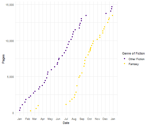
Let's recreate the pages read over 2019 chart, but this time, I'll just use fiction books and separate them as either fantasy or other fiction; this divides that dataset pretty evenly in half. Here's how I'd generate the pages read over time separately by those two genre categories.
library(tidyverse)
## -- Attaching packages ------------------------------------------- tidyverse 1.3.0 --
## <U+2713> ggplot2 3.2.1     <U+2713> purrr   0.3.3
## <U+2713> tibble  2.1.3     <U+2713> dplyr   0.8.3
## <U+2713> tidyr   1.0.0     <U+2713> stringr 1.4.0
## <U+2713> readr   1.3.1     <U+2713> forcats 0.4.0
## -- Conflicts ---------------------------------------------- tidyverse_conflicts() --
## x dplyr::filter() masks stats::filter()
## x dplyr::lag()    masks stats::lag()
reads2019 <- read_csv("~/Downloads/Blogging A to Z/SaraReads2019_allchanges.csv",
                      col_names = TRUE)
## Parsed with column specification:
## cols(
##   Title = col_character(),
##   Pages = col_double(),
##   date_started = col_character(),
##   date_read = col_character(),
##   Book.ID = col_double(),
##   Author = col_character(),
##   AdditionalAuthors = col_character(),
##   AverageRating = col_double(),
##   OriginalPublicationYear = col_double(),
##   read_time = col_double(),
##   MyRating = col_double(),
##   Gender = col_double(),
##   Fiction = col_double(),
##   Childrens = col_double(),
##   Fantasy = col_double(),
##   SciFi = col_double(),
##   Mystery = col_double(),
##   SelfHelp = col_double()
## )
fantasy <- reads2019 %>%
  filter(Fiction == 1) %>%
  mutate(date_read = as.Date(date_read, format = '%m/%d/%Y'),
         Fantasy = factor(Fantasy, levels = c(0,1),
                          labels = c("Other Fiction",
                                     "Fantasy"))) %>%
  group_by(Fantasy) %>%
  mutate(GenreRead = order_by(date_read, cumsum(Pages))) %>%
  ungroup()
Now I'd just plug that information into my ggplot code, but add a third variable in the aesthetics (aes) for ggplot - color = Fantasy.
library(scales)
## 
## Attaching package: 'scales'
## The following object is masked from 'package:purrr':
## 
##     discard
## The following object is masked from 'package:readr':
## 
##     col_factor
myplot <- fantasy %>%
  ggplot(aes(date_read, GenreRead, color = Fantasy)) +
  geom_point() +
  xlab("Date") +
  ylab("Pages") +
  scale_x_date(date_labels = "%b",
               date_breaks = "1 month") +
  scale_y_continuous(labels = comma, breaks = seq(0,30000,5000)) +
  labs(color = "Genre of Fiction")
This plot uses the default R colorscheme. I could change those colors, using an existing colorscheme, or define my own. Let's make a fivethirtyeight style figure, using their theme for the overall plot, and their color scheme for the genre variable.
library(ggthemes)
## Warning: package 'ggthemes' was built under R version 3.6.3
myplot +
  scale_color_fivethirtyeight() +
  theme_fivethirtyeight()

I can also specify my own colors.
myplot +
  scale_color_manual(values = c("#4b0082","#ffd700")) +
  theme_minimal()

The geom_point offers many point shapes; 21-25 allow you to specify both color and fill. But for the rest, only use color.
library(ggpubr)
## Warning: package 'ggpubr' was built under R version 3.6.3
## Loading required package: magrittr
## 
## Attaching package: 'magrittr'
## The following object is masked from 'package:purrr':
## 
##     set_names
## The following object is masked from 'package:tidyr':
## 
##     extract
ggpubr::show_point_shapes()
## Scale for 'y' is already present. Adding another scale for 'y', which will
## replace the existing scale.

Of course, you may have plots where changing fill is best, such as on a bar plot. In my summarize example, I created a stacked bar chart of fiction versus non-fiction with author gender as the fill.
reads2019 %>%
  mutate(Gender = factor(Gender, levels = c(0,1),
                         labels = c("Male",
                                    "Female")),
         Fiction = factor(Fiction, levels = c(0,1),
                          labels = c("Non-Fiction",
                                     "Fiction"),
                          ordered = TRUE)) %>%
  group_by(Gender, Fiction) %>%
  summarise(Books = n()) %>%
  ggplot(aes(Fiction, Books, fill = reorder(Gender, desc(Gender)))) +
  geom_col() +
  scale_fill_economist() +
  xlab("Genre") +
  labs(fill = "Author Gender")

Stacking is the default, but I could also have the bars next to each other.
reads2019 %>%
  mutate(Gender = factor(Gender, levels = c(0,1),
                         labels = c("Male",
                                    "Female")),
         Fiction = factor(Fiction, levels = c(0,1),
                          labels = c("Non-Fiction",
                                     "Fiction"),
                          ordered = TRUE)) %>%
  group_by(Gender, Fiction) %>%
  summarise(Books = n()) %>%
  ggplot(aes(Fiction, Books, fill = reorder(Gender, desc(Gender)))) +
  geom_col(position = "dodge") +
  scale_fill_economist() +
  xlab("Genre") +
  labs(fill = "Author Gender")

You can also use fill (or color) with the same variable you used for x or y; that is, instead of having it be a third scale, it could add some color and separation to distinguish categories from the x or y variable. This is especially helpful if you have multiple categories being plotted, because it helps break up the wall of bars. If you do this, I'd recommend choosing a color palette with highly complementary colors, rather than highly contrasting ones; you probably also want to drop the legend, though, since the axis will also be labeled.
genres <- reads2019 %>%
  group_by(Fiction, Childrens, Fantasy, SciFi, Mystery) %>%
  summarise(Books = n())

genres <- genres %>%
  bind_cols(Genre = c("Non-Fiction",
           "General Fiction",
           "Mystery",
           "Science Fiction",
           "Fantasy",
           "Fantasy Sci-Fi",
           "Children's Fiction",
           "Children's Fantasy"))

genres %>%
  filter(Genre != "Non-Fiction") %>%
  ggplot(aes(reorder(Genre, -Books), Books, fill = Genre)) +
  geom_col() +
  xlab("Genre") +
  scale_x_discrete(labels=function(x){sub("\\s", "\n", x)}) +
  scale_fill_economist() +
  theme(legend.position = "none")

If you only have a couple categories and want to draw a contrast, that's when you can use contrasting shades: for instance, at work, when I plot performance on an item, I use red for incorrect and blue for correct, to maximize the contrast between the two performance levels for whatever data I'm presenting.

I hope you enjoyed this series! There's so much more you can do with tidyverse than what I covered this month. Hopefully this has given you enough to get started and sparked your interest to learn more. Once again, I highly recommend checking out R for Data Science.

Wednesday, April 29, 2020

Y is for scale_y

Yesterday, I talked about scale_x. Today, I'll continue on that topic, focusing on the y-axis.

The key to using any of the scale_ functions is to know what sort of data you're working with (e.g., date, continuous, discrete). Yesterday, I talked about scale_x_date and scale_x_discrete. We often put these types of data on the x-axis, while the y-axis is frequently used for counts. When displaying counts, we want to think about the major breaks that make sense, as well as any additional formatting to make them easier to read.

If I go back to my pages over time plot, you'll notice the major breaks are in the tens of thousands. We're generally used to seeing those values with a comma separating the thousands from the hundreds. I could add those to my plot like this (with a little help from the scales package).
library(tidyverse)
## -- Attaching packages ------------------------------------------- tidyverse 1.3.0 --
## <U+2713> ggplot2 3.2.1     <U+2713> purrr   0.3.3
## <U+2713> tibble  2.1.3     <U+2713> dplyr   0.8.3
## <U+2713> tidyr   1.0.0     <U+2713> stringr 1.4.0
## <U+2713> readr   1.3.1     <U+2713> forcats 0.4.0
## -- Conflicts ---------------------------------------------- tidyverse_conflicts() --
## x dplyr::filter() masks stats::filter()
## x dplyr::lag()    masks stats::lag()
reads2019 <- read_csv("~/Downloads/Blogging A to Z/SaraReads2019_allchanges.csv",
                      col_names = TRUE)
## Parsed with column specification:
## cols(
##   Title = col_character(),
##   Pages = col_double(),
##   date_started = col_character(),
##   date_read = col_character(),
##   Book.ID = col_double(),
##   Author = col_character(),
##   AdditionalAuthors = col_character(),
##   AverageRating = col_double(),
##   OriginalPublicationYear = col_double(),
##   read_time = col_double(),
##   MyRating = col_double(),
##   Gender = col_double(),
##   Fiction = col_double(),
##   Childrens = col_double(),
##   Fantasy = col_double(),
##   SciFi = col_double(),
##   Mystery = col_double(),
##   SelfHelp = col_double()
## )
reads2019 <- reads2019 %>%
  mutate(date_started = as.Date(reads2019$date_started, format = '%m/%d/%Y'),
         date_read = as.Date(date_read, format = '%m/%d/%Y'),
         PagesRead = order_by(date_read, cumsum(Pages)))

library(scales)
## 
## Attaching package: 'scales'
## The following object is masked from 'package:purrr':
## 
##     discard
## The following object is masked from 'package:readr':
## 
##     col_factor
reads2019 %>%
  ggplot(aes(date_read, PagesRead)) +
  geom_point() +
  scale_x_date(date_labels = "%B",
               date_breaks = "1 month") +
  scale_y_continuous(labels = comma) +
  labs(title = "Cumulative Pages Read Over 2019") +
  theme(plot.title = element_text(hjust = 0.5))
I could also add more major breaks.
reads2019 %>%
  ggplot(aes(date_read, PagesRead)) +
  geom_point() +
  scale_x_date(date_labels = "%B",
               date_breaks = "1 month") +
  scale_y_continuous(labels = comma,
                     breaks = seq(0, 30000, 5000)) +
  labs(title = "Cumulative Pages Read Over 2019") +
  theme(plot.title = element_text(hjust = 0.5))
The scales package offers other ways to format data besides the 3 I've shown in this series (log transformation, percent, and now continuous with comma). It also lets you format data with currency, bytes, ranks, and scientific notation.

Last post tomorrow!

Tuesday, April 28, 2020

X is for scale_x

These next two posts will deal with formatting scales in ggplot2 - x-axis, y-axis - so I'll try to limit the amount of overlap and repetition.

Let's say I wanted to plot my reading over time, specifically as a cumulative sum of pages across the year. My x-axis will be a date. Since my reads2019 file initially formats my dates as character, I'll need to use my mutate code to turn them into dates, plus compute my cumulative sum of pages read.
library(tidyverse)
## -- Attaching packages ------------------------------------------- tidyverse 1.3.0 --
## <U+2713> ggplot2 3.2.1     <U+2713> purrr   0.3.3
## <U+2713> tibble  2.1.3     <U+2713> dplyr   0.8.3
## <U+2713> tidyr   1.0.0     <U+2713> stringr 1.4.0
## <U+2713> readr   1.3.1     <U+2713> forcats 0.4.0
## -- Conflicts ---------------------------------------------- tidyverse_conflicts() --
## x dplyr::filter() masks stats::filter()
## x dplyr::lag()    masks stats::lag()
reads2019 <- read_csv("~/Downloads/Blogging A to Z/SaraReads2019_allchanges.csv",
                      col_names = TRUE)
## Parsed with column specification:
## cols(
##   Title = col_character(),
##   Pages = col_double(),
##   date_started = col_character(),
##   date_read = col_character(),
##   Book.ID = col_double(),
##   Author = col_character(),
##   AdditionalAuthors = col_character(),
##   AverageRating = col_double(),
##   OriginalPublicationYear = col_double(),
##   read_time = col_double(),
##   MyRating = col_double(),
##   Gender = col_double(),
##   Fiction = col_double(),
##   Childrens = col_double(),
##   Fantasy = col_double(),
##   SciFi = col_double(),
##   Mystery = col_double(),
##   SelfHelp = col_double()
## )
reads2019 <- reads2019 %>%
  mutate(date_started = as.Date(reads2019$date_started, format = '%m/%d/%Y'),
         date_read = as.Date(date_read, format = '%m/%d/%Y'),
         PagesRead = order_by(date_read, cumsum(Pages)))
This gives me the variables I need to plot my pages read over time.
reads2019 %>%
  ggplot(aes(date_read, PagesRead)) +
  geom_point()

ggplot2 did a fine job of creating this plot using default settings. Since my date_read variable is a date, the plot automatically ordered date_read, formatted as "Month Year", and used quarters as breaks. But we can still use the scale_x functions to make this plot look even better.

One way could be to format years as 2-digit instead of 4. We could also have month breaks instead of quarters.
reads2019 %>%
  ggplot(aes(date_read, PagesRead)) +
  geom_point() +
  scale_x_date(date_labels = "%b %y",
               date_breaks = "1 month")

Of course, we could drop year completely and just show month, since all of this data is for 2019. We could then note that in the title instead.
reads2019 %>%
  ggplot(aes(date_read, PagesRead)) +
  geom_point() +
  scale_x_date(date_labels = "%B",
               date_breaks = "1 month") +
  labs(title = "Cumulative Pages Read Over 2019") +
  theme(plot.title = element_text(hjust = 0.5))


Tomorrow, I'll show some tricks for how we can format the y-axis of this plot. But let's see what else we can do to the x-axis. Let's create a bar graph with my genre data. I'll use the genre names I created for my summarized data last week.
genres <- reads2019 %>%
  group_by(Fiction, Childrens, Fantasy, SciFi, Mystery) %>%
  summarise(Books = n())

genres <- genres %>%
  bind_cols(Genre = c("Non-Fiction",
           "General Fiction",
           "Mystery",
           "Science Fiction",
           "Fantasy",
           "Fantasy Sci-Fi",
           "Children's Fiction",
           "Children's Fantasy"))

genres %>%
  ggplot(aes(Genre, Books)) +
  geom_col()

Unfortunately, my new genre names are a bit long, and overlap each other unless I make my plot really wide. There are a few ways I can deal with that. First, I could ask ggplot2 to abbreviate the names.
genres %>%
  ggplot(aes(Genre, Books)) +
  geom_col() +
  scale_x_discrete(labels = abbreviate)

These abbreviations were generated automatically by R, and I'm not a huge fan. A better way might be to add line breaks to any two-word genres. This Stack Overflow post gave me a function I can add to my scale_x_discrete to do just that.
genres %>%
  ggplot(aes(Genre, Books)) +
  geom_col() +
  scale_x_discrete(labels=function(x){sub("\\s", "\n", x)})


MUCH better!

As you can see, the scale_x function you use depends on the type of data you're working with. For dates, scale_x_date; for categories, scale_x_discrete. Tomorrow, we'll show some ways to format continuous data, since that's often what you see on the y-axis. See you then!

By the way, this is my 1000th post on my blog!

Monday, April 27, 2020

W is for Write and Read Data - Fast

Once again, I'm dipping outside of the tidyverse, but this package and its functions have been really useful in getting data quickly in (and out) of R.

For work, I have to pull in data from a few different sources, and manipulate and work with them to give me the final dataset that I use for much of my analysis. So that I don't have to go through all of that joining, recoding, and calculating each time, I created a final merged dataset as a CSV file that I can load when I need to continue my analysis. The problem is that the most recent version of that file, which contains 13 million+ records, was so large, writing it (and subsequently reading it in later) took forever and sometimes timed out.

That's when I discovered the data.table library, and its fread and fwrite functions. Tidyverse is great for working with CSV files, but a lot of the memory and loading time is used for formatting. fread and fwrite are leaner and get the job done a bit faster. For regular-sized CSV files (like my reads2019 set), the time difference is pretty minimal. But for a 5GB datafile, it makes a huge difference.
library(tidyverse)
## -- Attaching packages ------------------------------------------- tidyverse 1.3.0 --
## <U+2713> ggplot2 3.2.1     <U+2713> purrr   0.3.3
## <U+2713> tibble  2.1.3     <U+2713> dplyr   0.8.3
## <U+2713> tidyr   1.0.0     <U+2713> stringr 1.4.0
## <U+2713> readr   1.3.1     <U+2713> forcats 0.4.0
## -- Conflicts ---------------------------------------------- tidyverse_conflicts() --
## x dplyr::filter() masks stats::filter()
## x dplyr::lag()    masks stats::lag()
system.time(reads2019 <- read_csv("~/Downloads/Blogging A to Z/SaraReads2019_allchanges.csv",
                      col_names = TRUE))
## Parsed with column specification:
## cols(
##   Title = col_character(),
##   Pages = col_double(),
##   date_started = col_character(),
##   date_read = col_character(),
##   Book.ID = col_double(),
##   Author = col_character(),
##   AdditionalAuthors = col_character(),
##   AverageRating = col_double(),
##   OriginalPublicationYear = col_double(),
##   read_time = col_double(),
##   MyRating = col_double(),
##   Gender = col_double(),
##   Fiction = col_double(),
##   Childrens = col_double(),
##   Fantasy = col_double(),
##   SciFi = col_double(),
##   Mystery = col_double(),
##   SelfHelp = col_double()
## )
##    user  system elapsed 
##    0.00    0.10    0.14
rm(reads2019)

library(data.table)
## 
## Attaching package: 'data.table'
## The following objects are masked from 'package:dplyr':
## 
##     between, first, last
## The following object is masked from 'package:purrr':
## 
##     transpose
system.time(reads2019 <- fread("~/Downloads/Blogging A to Z/SaraReads2019_allchanges.csv"))
##    user  system elapsed 
##       0       0       0
But let's show how long it took to read my work datafile. Here's the elapsed time from the system.time output.

read_csv:
user system elapsed
61.14 11.72 90.56

fread:
user system elapsed
57.97 16.40 57.19

But the real win is in how quickly this package writes CSV data. Using a package called wakefield, I'll randomly generate 10,000,000 records of survey data, then see how it takes to write the data to file using both write_csv and fwrite.
library(wakefield)
## Warning: package 'wakefield' was built under R version 3.6.3
## 
## Attaching package: 'wakefield'
## The following objects are masked from 'package:data.table':
## 
##     hour, minute, month, second, year
## The following object is masked from 'package:dplyr':
## 
##     id
set.seed(42)

reallybigshew <- r_data_frame(n = 10000000,
                              id,
                              race,
                              age,
                              smokes,
                              marital,
                              Start = hour,
                              End = hour,
                              iq,
                              height,
                              died)


system.time(write_csv(reallybigshew, "~/Downloads/Blogging A to Z/bigdata1.csv"))
##    user  system elapsed 
##  134.22    2.52  137.80
system.time(fwrite(reallybigshew, "~/Downloads/Blogging A to Z/bigdata2.csv"))
##    user  system elapsed 
##    8.65    0.32    2.77

Saturday, April 25, 2020

V is for Verbs

In this series, I've covered five terms for data manipulation:
  • arrange
  • filter
  • mutate
  • select
  • summarise
These are the verbs that make up the grammar of data manipulation. They all work with group_by to perform these functions groupwise.

There are scoped versions of these verbs, which add _all, _if, or _at, that allow you to perform these verbs on multiple variables simultaneously. For instance, I could get means for all of my numeric variables like this. (Quick note: I created an updated reading dataset that has all publication years filled in. You can download it here.)
library(tidyverse)
## -- Attaching packages ------------------------------------------- tidyverse 1.3.0 --
## <U+2713> ggplot2 3.2.1     <U+2713> purrr   0.3.3
## <U+2713> tibble  2.1.3     <U+2713> dplyr   0.8.3
## <U+2713> tidyr   1.0.0     <U+2713> stringr 1.4.0
## <U+2713> readr   1.3.1     <U+2713> forcats 0.4.0
## -- Conflicts ---------------------------------------------- tidyverse_conflicts() --
## x dplyr::filter() masks stats::filter()
## x dplyr::lag()    masks stats::lag()
reads2019 <- read_csv("~/Downloads/Blogging A to Z/SaraReads2019_allchanges.csv",
                      col_names = TRUE)
## Parsed with column specification:
## cols(
##   Title = col_character(),
##   Pages = col_double(),
##   date_started = col_character(),
##   date_read = col_character(),
##   Book.ID = col_double(),
##   Author = col_character(),
##   AdditionalAuthors = col_character(),
##   AverageRating = col_double(),
##   OriginalPublicationYear = col_double(),
##   read_time = col_double(),
##   MyRating = col_double(),
##   Gender = col_double(),
##   Fiction = col_double(),
##   Childrens = col_double(),
##   Fantasy = col_double(),
##   SciFi = col_double(),
##   Mystery = col_double(),
##   SelfHelp = col_double()
## )
reads2019 %>%
  summarise_if(is.numeric, list(mean))
## # A tibble: 1 x 13
##   Pages Book.ID AverageRating OriginalPublica… read_time MyRating Gender Fiction
##   <dbl>   <dbl>         <dbl>            <dbl>     <dbl>    <dbl>  <dbl>   <dbl>
## 1  341.  1.36e7          3.94            1989.      3.92     4.14  0.310   0.931
## # … with 5 more variables: Childrens <dbl>, Fantasy <dbl>, SciFi <dbl>,
## #   Mystery <dbl>, SelfHelp <dbl>
This function generated the mean for every numeric variable in my dataset. But even though they're all numeric, the mean isn't the best statistic for many of them, for instance book ID or publication year. We could just generate means for specific variables with summarise_at.
reads2019 %>%
  summarise_at(vars(Pages, AverageRating, read_time, MyRating), list(mean))
## # A tibble: 1 x 4
##   Pages AverageRating read_time MyRating
##   <dbl>         <dbl>     <dbl>    <dbl>
## 1  341.          3.94      3.92     4.14
You can also request more than one piece of information in your list, and request that R create a new label for each variable.
numeric_summary <- reads2019 %>%
  summarise_at(vars(Pages, AverageRating, read_time, MyRating), list("mean" = mean, "median" = median))
I use the basic verbs anytime I use R. I only learned about scoped verbs recently, and I'm sure I'll add them to my toolkit over time.

Next week is the last week of Blogging A to Z! See you then!

Friday, April 24, 2020

U is for Useful Trick

This will be a very short post for a line of code I've found unbelievably useful as I analyze data for work. I'm working with datasets containing millions of rows of data. (The most recent one I worked with had about 13 million records.) Because R loads datasets into memory, you can run out of RAM pretty quickly when working with data that large. As I start getting access to more services for databasing and cloud computing, I'm hoping to move some of that data out of my own memory, and onto something with more memory. But for now, I found this quick fix.

I increased my paging file (virtual memory) on my computer as high as it will let me, but R doesn't automatically increase its memory limits. But a single line of code will do that for you.
invisible(utils::memory.limit(64000))
Set that value to whatever your virtual memory is set for. (Note that this value is in MB.) Huge thanks for this Stack Overflow post that taught me how to do this.

Monday, I'll talk about some functions that allow you more quickly read (and write) large files.

Thursday, April 23, 2020

T is for Themes

One of the easiest ways to make a beautiful ggplot is by using a theme. ggplot2 comes with a variety of pre-existing themes. I'll use the genre statistics summary table I created in yesterday's post, and create the same chart with different themes.
library(tidyverse)
## -- Attaching packages ------------------------------------------- tidyverse 1.3.0 --
## <U+2713> ggplot2 3.2.1     <U+2713> purrr   0.3.3
## <U+2713> tibble  2.1.3     <U+2713> dplyr   0.8.3
## <U+2713> tidyr   1.0.0     <U+2713> stringr 1.4.0
## <U+2713> readr   1.3.1     <U+2713> forcats 0.4.0
## -- Conflicts ---------------------------------------------- tidyverse_conflicts() --
## x dplyr::filter() masks stats::filter()
## x dplyr::lag()    masks stats::lag()
reads2019 <- read_csv("~/Downloads/Blogging A to Z/SaraReads2019_allrated.csv",
                      col_names = TRUE)
## Parsed with column specification:
## cols(
##   Title = col_character(),
##   Pages = col_double(),
##   date_started = col_character(),
##   date_read = col_character(),
##   Book.ID = col_double(),
##   Author = col_character(),
##   AdditionalAuthors = col_character(),
##   AverageRating = col_double(),
##   OriginalPublicationYear = col_double(),
##   read_time = col_double(),
##   MyRating = col_double(),
##   Gender = col_double(),
##   Fiction = col_double(),
##   Childrens = col_double(),
##   Fantasy = col_double(),
##   SciFi = col_double(),
##   Mystery = col_double(),
##   SelfHelp = col_double()
## )
genrestats <- reads2019 %>%
  filter(Fiction == 1) %>%
  arrange(OriginalPublicationYear) %>%
  group_by(Childrens, Fantasy, SciFi, Mystery) %>%
  summarise(Books = n(),
            WomenAuthors = sum(Gender),
            AvgLength = mean(Pages),
            AvgRating = mean(MyRating))

genrestats <- genrestats %>%
  bind_cols(Genre = c("General Fiction",
                   "Mystery",
                   "Science Fiction",
                   "Fantasy",
                   "Fantasy SciFi",
                   "Children's Fiction",
                   "Children's Fantasy")) %>%
  ungroup() %>%
  select(Genre, everything(), -Childrens, -Fantasy, -SciFi, -Mystery)

genre <- genrestats %>%
  ggplot(aes(Genre, Books)) +
  geom_col() +
  scale_y_continuous(breaks = seq(0,20,1))
Since I've created a new object for my figure, I can add a theme by typing genre + [theme]. Here's a handful of the ggplot2 themes.


You can also get more themes with additional packages. My new favorite is ggthemes. I've been loving their Economist themes (particularly economist_white), which I've been using for most of the plots I create at work. Here are some of my favorites.


You can also customize different elements of the plot with theme(). For instance, theme(plot.title = element_text(hjust = 0.5)) centers your plot title. theme(legend.position = "none") removes the legend. You could do both of these at once within the same theme() by separating them with commas. This is a great way to tweak tiny elements of your plot, or if you want to create your own custom theme.
library(ggthemes)
## Warning: package 'ggthemes' was built under R version 3.6.3
genre +
  theme_economist_white() +
  theme(plot.background = element_rect(fill = "lightblue"))

These themes also have color schemes you can add to your plot. We'll talk about that soon!

Wednesday, April 22, 2020

S is for summarise

Today, we'll finally talk about summarise! It's very similar to mutate, but instead of adding or altering a variable in a dataset, it aggregates your data, creating a new tibble with the columns containing your requested summary data. The number of rows will be equal to the number of groups from group_by (if you don't specify any groups, your tibble will have one row that summarizes your entire dataset).

These days, when I want descriptive statistics from a dataset, I generally use summarise, because I can specify the exact statistics I want in the exact order I want (for easy pasting of tables into a report or presentation).

Also, if you're not a fan of the UK spelling, summarize works exactly the same. The same is true of other R/tidyverse functions, like color versus colour.

Let's load the reads2019 dataset and start summarizing!
library(tidyverse)
## -- Attaching packages ------------------------------------------- tidyverse 1.3.0 --
## <U+2713> ggplot2 3.2.1     <U+2713> purrr   0.3.3
## <U+2713> tibble  2.1.3     <U+2713> dplyr   0.8.3
## <U+2713> tidyr   1.0.0     <U+2713> stringr 1.4.0
## <U+2713> readr   1.3.1     <U+2713> forcats 0.4.0
## -- Conflicts ---------------------------------------------- tidyverse_conflicts() --
## x dplyr::filter() masks stats::filter()
## x dplyr::lag()    masks stats::lag()
reads2019 <- read_csv("~/Downloads/Blogging A to Z/SaraReads2019_allrated.csv",
                      col_names = TRUE)
## Parsed with column specification:
## cols(
##   Title = col_character(),
##   Pages = col_double(),
##   date_started = col_character(),
##   date_read = col_character(),
##   Book.ID = col_double(),
##   Author = col_character(),
##   AdditionalAuthors = col_character(),
##   AverageRating = col_double(),
##   OriginalPublicationYear = col_double(),
##   read_time = col_double(),
##   MyRating = col_double(),
##   Gender = col_double(),
##   Fiction = col_double(),
##   Childrens = col_double(),
##   Fantasy = col_double(),
##   SciFi = col_double(),
##   Mystery = col_double(),
##   SelfHelp = col_double()
## )
First, we could use summarise to give us some basic descriptives of the whole dataset. If we want to save the results to a tibble, we would give it a new name, or we could just have it display those results and not save them. Here's what happens when I request a summary without saving a new tibble.
reads2019 %>%
  summarise(AllPages = sum(Pages),
            AvgLength = mean(Pages),
            AvgRating = mean(MyRating),
            AvgReadTime = mean(read_time),
            ShortRT = min(read_time),
            LongRT = max(read_time),
            TotalAuthors = n_distinct(Author))
## # A tibble: 1 x 7
##   AllPages AvgLength AvgRating AvgReadTime ShortRT LongRT TotalAuthors
##      <dbl>     <dbl>     <dbl>       <dbl>   <dbl>  <dbl>        <int>
## 1    29696      341.      4.14        3.92       0     25           42
Now, let's create a summary where we do save it as a tibble. And let's have it create some groups for us. In the dataset, I coded author gender, with female authors coded as 1, so I can find out how many women writers are represented in a group by summing that variable. I also want to fill in a few missing publication dates, which seems to happen for Kindle version of books or books by small publishers. This will let me find out my newest and oldest books in each group; I just arrange by publication year, then request last and first, respectively. Two books were published in 2019, so I'll replace the others based on title, then have R give the remaining NAs a year of 2019.
reads2019 %>%
  filter(is.na(OriginalPublicationYear)) %>%
  select(Title)
## # A tibble: 5 x 1
##   Title                                                                         
##   <chr>                                                                         
## 1 Empath: A Complete Guide for Developing Your Gift and Finding Your Sense of S…
## 2 Perilous Pottery (Cozy Corgi Mysteries, #11)                                  
## 3 Precarious Pasta (Cozy Corgi Mysteries, #14)                                  
## 4 Summerdale                                                                    
## 5 Swarm Theory
reads2019 <- reads2019 %>%
  mutate(OriginalPublicationYear = replace(OriginalPublicationYear,
                                           Title == "Empath: A Complete Guide for Developing Your Gift and Finding Your Sense of Self", 2017),
         OriginalPublicationYear = replace(OriginalPublicationYear,
                                           Title == "Summerdale", 2018),
         OriginalPublicationYear = replace(OriginalPublicationYear,
                                           Title == "Swarm Theory", 2016),
         OriginalPublicationYear = replace_na(OriginalPublicationYear, 2019))

genrestats <- reads2019 %>%
  filter(Fiction == 1) %>%
  arrange(OriginalPublicationYear) %>%
  group_by(Childrens, Fantasy, SciFi, Mystery) %>%
  summarise(Books = n(),
            WomenAuthors = sum(Gender),
            AvgLength = mean(Pages),
            AvgRating = mean(MyRating),
            NewestBook = last(OriginalPublicationYear),
            OldestBook = first(OriginalPublicationYear))
Now let's turn this summary into a nicer, labeled table.
genrestats <- genrestats %>%
  bind_cols(Genre = c("General Fiction",
                   "Mystery",
                   "Science Fiction",
                   "Fantasy",
                   "Fantasy SciFi",
                   "Children's Fiction",
                   "Children's Fantasy")) %>%
  ungroup() %>%
  select(Genre, everything(), -Childrens, -Fantasy, -SciFi, -Mystery)

library(expss)
## 
## Attaching package: 'expss'
## The following objects are masked from 'package:stringr':
## 
##     fixed, regex
## The following objects are masked from 'package:dplyr':
## 
##     between, compute, contains, first, last, na_if, recode, vars
## The following objects are masked from 'package:purrr':
## 
##     keep, modify, modify_if, transpose
## The following objects are masked from 'package:tidyr':
## 
##     contains, nest
## The following object is masked from 'package:ggplot2':
## 
##     vars
as.etable(genrestats, rownames_as_row_labels = NULL)
Genre  Books   WomenAuthors   AvgLength   AvgRating   NewestBook   OldestBook 
 General Fiction  15 10 320.1 4.1 2019 1941
 Mystery  9 8 316.3 3.8 2019 1950
 Science Fiction  19 4 361.4 4.4 2019 1959
 Fantasy  19 3 426.3 4.2 2019 1981
 Fantasy SciFi  2 0 687.0 4.5 2009 2006
 Children's Fiction  1 0 181.0 4.0 2016 2016
 Children's Fantasy  16 1 250.6 4.2 2008 1900
I could have used other base R functions in my summary as well - such as sd, median, min, max, and so on. You can also summarize a dataset and create a plot of that summary in the same code.
library(ggthemes)
## Warning: package 'ggthemes' was built under R version 3.6.3
reads2019 %>%
  mutate(Gender = factor(Gender, levels = c(0,1),
                         labels = c("Male",
                                    "Female")),
         Fiction = factor(Fiction, levels = c(0,1),
                          labels = c("Non-Fiction",
                                     "Fiction"),
                          ordered = TRUE)) %>%
  group_by(Gender, Fiction) %>%
  summarise(Books = n()) %>%
  ggplot(aes(Fiction, Books)) +
  geom_col(aes(fill = reorder(Gender, desc(Gender)))) +
  scale_fill_economist() +
  xlab("Genre") +
  labs(fill = "Author Gender")