For instance, I had R randomly generate 10 values:
25.5, 17.7, 21.5, 22.5, 21.6, 19.6, 26.0, 19.6, 28.1, 19.7
If I wanted to find the quartiles of these values, the first thing I'd need to do is put them in order:
17.7, 19.6, 19.6, 19.7, 21.5, 21.6, 22.5, 25.5, 26.0, 28.1
The median is the middle value. Since there are 10 values, the middle is actually in between two numbers. I would take the average of the 5th and 6th number to find the median: (21.5 + 21.6)/2 = 21.55 (or rounded off, 21.6). Then we would find the other two quartiles by taking the median of the two halves. The middle value of the first half, the third value, is 19.6. The middle value of the second half, the eighth value, is 25.5. These three quartiles are bound by the minimum value, 17.7 and the maximum value, 28.1.
So this gives me information I can use to summarize my distribution for you.
Min: 17.7
Q1: 19.6
Q2: 21.6
Q3: 25.5
Max: 28.1
But I could instead present these results visually, using a boxplot, also known as a box and whiskers plot. The boxplot, developed by mathematician John Tukey (who I plan on profiling at some point in the near future), presents the 5 values above. The box contains the 3 quartiles - one side of the box is Q1, the other side is Q3, and a bold line in the middle represents Q2. Two whiskers give the minimum and maximum values. Boxplots are incredibly easy to generate in R.
Let's create the 10 randomly generated numbers from above. I set the seed so you can create the same data on your own:
set.seed(42)
quartiles<- data.frame(score=rnorm(10,20,4))
quartiles
score
1 25.48383
2 17.74121
3 21.45251
4 22.53145
5 21.61707
6 19.57550
7 26.04609
8 19.62136
9 28.07369
10 19.74914
R has a built-in boxplot function:
boxplot(quartiles$score)

This plot displays all of the summary information from above. I would probably change the axis so the plot is a bit more understandable.
boxplot(quartiles$score, ylim=c(15,30))
Which gives me this:

hist(friends1$Pages, main="Book Length", xlab="Number of Pages", ylim=c(0,300))

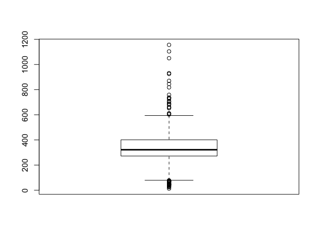
boxplot(Goodreads$Pages)
No comments:
Post a Comment