Tuesday, August 7, 2018

Statistics Sunday: Highlighting a Subset of Data in ggplot2

Highlighting Specific Cases in ggplot2 Here's my belated Statistics Sunday post, using a cool technique I just learned about: gghighlight. This R package works with ggplot2 to highlight a subset of data. To demonstrate, I'll use a dataset I analyzed for a previous post about my 2017 reading habits. [Side note: My reading goal for this year is 60 books, and I'm already at 43! I may have to increase my goal at some point.]

setwd("~/R")
library(tidyverse)
books<-read_csv("2017_books.csv", col_names = TRUE)
## Warning: Duplicated column names deduplicated: 'Author' => 'Author_1' [13]
## Parsed with column specification:
## cols(
##   .default = col_integer(),
##   Title = col_character(),
##   Author = col_character(),
##   G_Rating = col_double(),
##   Started = col_character(),
##   Finished = col_character()
## )
## See spec(...) for full column specifications.

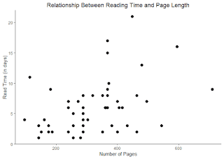
One analysis I conducted with this dataset was to look at the correlation between book length (number of pages) and read time (number of days it took to read the book). We can also generate a scatterplot to visualize this relationship.

cor.test(books$Pages, books$Read_Time)
## 
## 	Pearson's product-moment correlation
## 
## data:  books$Pages and books$Read_Time
## t = 3.1396, df = 51, p-value = 0.002812
## alternative hypothesis: true correlation is not equal to 0
## 95 percent confidence interval:
##  0.1482981 0.6067498
## sample estimates:
##       cor 
## 0.4024597
scatter <- ggplot(books, aes(Pages, Read_Time)) +
  geom_point(size = 3) +
  theme_classic() +
  labs(title = "Relationship Between Reading Time and Page Length") +
  ylab("Read Time (in days)") +
  xlab("Number of Pages") +
  theme(legend.position="none",plot.title=element_text(hjust=0.5))

There's a significant positive correlation here, meaning the longer books take more days to read. It's a moderate correlation, and there are certainly other variables that may explain why a book took longer to read. For instance, nonfiction books may take longer. Books read in October or November (while I was gearing up for and participating in NaNoWriMo, respectively) may also take longer, since I had less spare time to read. I can conduct regressions and other analyses to examine which variables impact read time, but one of the most important parts of sharing results is creating good data visualizations. How can I show the impact these other variables have on read time in an understandable and visually appealing way?

gghighlight will let me draw attention to different parts of the plot. For example, I can ask gghighlight to draw attention to books that took longer than a certain amount of time to read, and I can even ask it to label those books.
library(gghighlight)
scatter + gghighlight(Read_Time > 14) +
  geom_label(aes(label = Title),
             hjust = 1,
             vjust = 1,
             fill = "blue",
             color = "white",
             alpha = 0.5)


Here, the gghighlight function identifies the subset (books that took more than 2 weeks to read) and labels those books with the Title variable. Three of the four books with long read time values are non-fiction, and one was read for a course I took, so reading followed a set schedule. But the fourth is a fiction book, which took over 20 days to read. Let's see how month impacts reading time, by highlighting books read in November. To do that, I'll need to alter my dataset somewhat. The dataset contains a starting date and finish date, which were read in as characters. I need to convert those to dates and pull out the month variable to create my indicator.

library(lubridate)
## 
## Attaching package: 'lubridate'
## The following object is masked from 'package:base':
## 
##     date
books$Started <- mdy(books$Started)
books$Start_Month <- month(books$Started)
books$Month <- ifelse(books$Start_Month > 10 & books$Start_Month < 12, books$Month <- 1,
                      books$Month <- 0)
scatter + gghighlight(books$Month == 1) +
  geom_label(aes(label = Title), hjust = 1, vjust = 1, fill = "blue", color = "white", alpha = 0.5)


The book with the longest read time was, in fact, read during November, when I was spending most of my time writing.

1 comment:

  1. in the spirit of full reproducibility, would you consider sharing the 2017_books.csv file please so we can rerun the code for ourselves? thanks in advance

    ReplyDelete